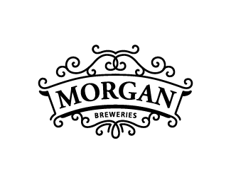
Morgan Breweries V. 2
by SamDeMastrie • Uploaded: Aug. 20 '11 - Gallerized: Dec. '11

Float
(Floaters:
89 )
Description:
This is the second version of this logo. I added more filigree and connected it to the frame.
Status:
Work in progress
Viewed:
11690
Share:


Lets Discuss
IMO, much better here.
ReplyI think so too. Thanks Colin.
ReplyI agree, nice update, Sam!
ReplyLooks nice.
ReplySean and Milou, gracias!
ReplyLike the 3D impression ... really improved !
Reply%5E That 3D impression is nice, I like that.
Replyboth great logos ... but I prefer this one ... gives me more !!
ReplyThank you Bernd.
Replynice details and light feel of the sign.
Replyglad to see this one made it in...i always preferred this one over the other.
Replyreally like this one:)
Replysweeet!
Replythis works well. nice!
ReplyGood balance between type %26 flourish)
ReplyThanks everyone for the kind words and the unexpected gallery spot!
ReplyVery handsome - congrats.
ReplyThis looks awesome!
ReplyOoowhh great one sam :)
ReplyGreat! :)
ReplyBeautiful work! Lovely ornaments.
ReplyI like this one.
ReplyPlease login/signup to make a comment, registration is easy