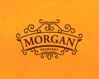
Morgan
by SamDeMastrie • Uploaded: Aug. 17 '11 - Gallerized: Aug. '11

Float
(Floaters:
52 )
Description:
Still very much a WIP. What do you think of the wrought iron filigree? Too much? Too little? I envisioned this being a logo for a local microbrewery that has a long, rich history crafting fine beers.
Status:
Just for fun
Viewed:
7348
Share:


Lets Discuss
This is nice. i think the filigree is good..good balance. by only nitpicks is that i thought the font was a touch too mundane, (Morgan), and i would have liked to see some small hint at the construction of the beer itself. hops etc..
ReplyThanks Gregory, good thoughts. I actually had the idea of putting a hops icon in here somewhere. Maybe I'll revisit it.
ReplyI like it, Sam. Simple, clean and elegant.
Replygreat, sam.
ReplySean, Colin, thanks for the kind words.
ReplyI like it, Sam.**Just a thought%3B feel free to raise your middle finger to this:**What if you really took the wrought iron thing and ran with it, and worked out a solution whereby the type looks like it's connected to its frame?**To give you an example of what I mean, here's the front of a flyer I did several years ago. I really went crazy with the flourishes - not suggesting that you do the same - but check the connectivity of the type:*http://farm1.static.flickr.com/173/399030248_fb397369ce_o.jpg**Not sure if a similar approach may be taking things too far, since you have a nice simplicity going on, but just figured I'd throw it out there.
Replyhi Sam, how is that beer ... very nice design ... I would spend a bit of time to make the Morgan type more unique ... but lovely little piece of art
ReplyHey thanks Jon and Bernd for your compliments and suggestions. I'll definitely spend more time on this.
Replyreally great.
ReplyThanks Claude.
Replyfeel sweet)
ReplyReally loving the simplistic style of this mark! Great job
ReplyNice one sam!
Replyooh...that's beautiful
ReplyThanks guys. I've got a new and improved version here: http://logopond.com/gallery/detail/144826
ReplyBeautiful logo! Very clean and nice!
ReplyPlease login/signup to make a comment, registration is easy