Personal Identity
by SamDeMastrie • Uploaded: Sep. 16 '11 - Gallerized: Apr. '15

Float
(Floaters:
140 )
Description:
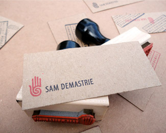
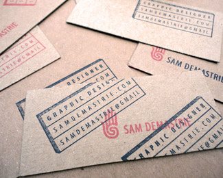
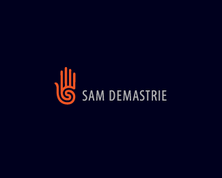
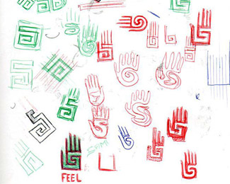
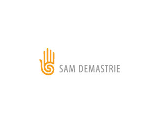
I explored several different ideas when brainstorming for a mark that could represent myself as a designer. I wanted something very simple and very powerful. Ultimately, I settled on a hand + spiral combination. I envisioned it as a modern re-imagining of the prehistoric and very familiar hand + spiral motif. I love the symbolism of the hand. To me, it represents a means of communication and creation—the act of making things, which is essentially what I do as a designer. In relation, I was also drawn to the word "feel," and the potential of it's double meaning—the physical act of touching/connecting by hand, and also the more emotional and intuitive meaning, whereby objects and ideas, especially in the design world, are often judged based on how they feel, or whether or not they feel right. The spiral is also something that appealed to me. It's an ancient symbol that can represent life, time, and continuity. It's also an interesting and very attractive object to look at.
The marriage of a very ancient, organic, and humanistic motif (hand + spiral) with that of a very modern, geometric, and logical physicality seemed like an appropriate duality with which to represent myself.
As seen on:
samdemastrie.com
Status:
Client work
Viewed:
14819
Share:
Lets Discuss
love it. there you go.
ReplyAwesome! Your name looks great here. Seeing this makes me want to add some text to mine.
Replythere he is...
Replyperfect
Replyplus you have an S shape in the middle of the vortex :)
ReplyThanks for the floats and the kind words everyone.
Replywow ... this combo is so awesome ...what a beautiful sign ... and the typefits very well .... like it so much !
ReplyThanks Bernd I appreciate it. Stay tuned for a website facelift.
ReplyHey guys, I just launched my new and improved website with this logo configuration. It's still a WIP, but I'd love to hear your thoughts.**samdemastrie.com
Reply%5E very nice sam. clean layout, strong works. why do you have lorem ipsum going on throughout some of the works for the descriptions?
ReplyThanks Colin. I haven't yet filled out all the body copy. Actually, I'm planning on rewriting most of it, so I used filler text as a temporary placeholder.
Replyshot you an email sam.
ReplyThanks, Colin. I saw it, I'll get to it soon.
Replyawesome job!
ReplyThank you much!
ReplyLanded nicely on your site!
ReplyThank you Alen.
Replynow it's looks better because of using your name
ReplyThanks Martyna.
ReplyIf anyone is interested, I just posted this project to Behance:
Replyhttp://www.behance.net/gallery/Personal-Identity/4041431
Congratulations on the feature.
ReplyCongrats Sam!
ReplyMy congratulations )
Replymy congrats go out to you, Sam the man!
ReplyWhat a great site to c u featured. Been a fan of your work. Congrats Sammy...:)
ReplyCongrats!
Replysame from me ... mega ... congrats brother !!!!
ReplyWOW! I never expected this! I feel grateful to be among such amazing talent. More on this project here if you're interested: behance.net/gallery/Personal-Identity/4041431
ReplyThank you so much!
Yes!! Great to see your mark on the home page :)
ReplyCongrats, dude!
ReplyCongrats on feature Sam. Loved going through your behance presentation.
ReplyWell deserved, buddy! Congratulations.
ReplyCongrats Sam!
ReplyCongratulations, Sam!
Replybig time congrats to you, sam.
Replywell done mate! great news!
ReplyCongrats!!!
ReplyCongrats!
ReplyWay to Go Sam.
Replyvery cool identity, congrats!
ReplyCongrats Sam!!
ReplyCongrats my friend....very well deserved!! :)
ReplyCongrats on feature!
ReplyThanks everyone for the very kind words! Very much appreciated. This is a great early birthday present for me (23rd), and I couldn't be happier about it.
ReplyCongratulations on your feature, Sam! What an awesome birthday present, indeed :)
ReplyCongrats Sam!
ReplyCongratulations on the feature.
ReplyCongrats Sam, lovely logo
ReplyThanks guys, I appreciate it.
ReplyCongrats, Sam!!
ReplyCongrats )
ReplyGreat mark. Congrats on the feature, Sam!
ReplyCongrats man.
ReplyHey everyone, I'm finally on Dribbble! Come follow me: http://dribbble.com/samdemastrie
ReplyHey Sam, cool logo but the problem is it's been around for over 10 years! That is TEVA's logo! That's even their brand color. Surely you must have seen this? http://www.h3publications.com/nucleus/media/83/20100506-tevaLogo.jpg
ReplySure wish I could comment about right now...
ReplyWhy can't I comment with what I really want to say? Grr...
ReplySure I'm aware of Teva. And yes, of course there are similarities here. But the hand/spiral motif is nothing new--it's probably been around for thousands of years. It's an ancient symbol (or a combination of two ancient symbols). Since I developed this mark three years ago, I've seen many similar. But all the similar marks I've seen are constructed like Teva's--a single spiral curling into the palm of the hand. The difference with mine is that the spiral turns inward from the thumb, forms an S (for Sam!), and turns back out again.
ReplyNot to mention my mark is constructed with strict geometry to reflect on the modern era.
ReplyThat being said, Teva makes footwear and I'm a designer. I think we're different enough anyhow.
ReplySorry for the flood of comments, I had to cut my paragraph into bits to post it.
Replyi think you're fine, sam...and fwiw, i prefer your mark a whole lot more than teva's.
Reply^ I agree with Colin Sam, the execution between them is signifigantly different.
ReplySide note: Teva's icon & logotype clash, severely.
^ agree all around!
Replywow Sam --- that's really great --- btw --- my avatar has never been featured too --- ;DDDDD
ReplyLongtime fave.
ReplyHey, look at that! Thanks to the person who put this in the gallery.
Reply^
Reply^ : )
Replylove it
ReplyI like the mark, but I think the type could be improved.
ReplyThanks Gareth, I agree.
ReplyAlso agree with Gareth. The mark is so strong, but the type kind of wants to command the attention due to the condensed style. Since the mark is fairly condensed, it might be nice to contrast it with a wider font. Also, I see no issues with the TEVA mark. Your design is miles away from theirs, and like you said, completely different markets.
ReplyI love your mark and I know how hard is to design one for yourself. Well done!
ReplyThanks people! @ocularink @aleksandra.malecka
ReplyJust love it!
ReplyPlease login/signup to make a comment, registration is easy