Description:
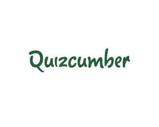
Revamped design, slightly new letterforms. A wordmark for a supermarket study on daily fruit & vegetable intake as well as tips for healthy eating.
Status:
Client work
Viewed:
7343
Share:

Lets Discuss
Nice logotype, Josh.
Replyexcellent work...
Replya beaut!
Replynice typo!
ReplyThanks all!! I'm pleased to say that this has been client approved. :)
ReplyGratz, Josh! Nice logotype!
Replyyea, this looks great.
ReplyThis looks great Josh...nice work mate.
ReplyThanks lads!!
ReplyNice, Josh.
ReplyThanks Sean :) I've been meaning to reply to that email too.
ReplyNo problem, bro. I can't ever get back to people either! :)
ReplyI'll send you something tonight... :)
Replynice execution bud. Good work on the spacing of letterforms.
Replycutecumber! :D
ReplyThanks guys!!**Kerning is good for the soul...
ReplyI hate cucumber, but I love this :)
Replyhaha!! Thanks Mate :)
ReplyI stayed up all night and nothing. Is this how much you care about me? :)
ReplyIt's not you...it's me I have to work on :P**It's coming...
ReplyKudos.
ReplyThanks Mads :)
ReplyRomy font... one of my favourites! Good work.
ReplyGood eye :) Romy was the base I used, but all the letterforms have been customised. Cheers!
Reply%5E so cool that's my daughters name. Romy %3B)
ReplySee...you're influentail without trying %3B)
Replyawesome is the made entirely from scratch or is it a font
ReplyThanks mrizzle!! To answer your question%3B Both :)**I used a font called 'Romy' as a base %26 manipulated each letter to achieve the shapes I wanted. The Q %26 z recieved the most tweeking and the b was drawn from scratch.
ReplyThe type feels like cucumber, amazing stuff
ReplyThanks Mate :) It was a great project, I don't get the change to do logotype's very often.
ReplyPlease login/signup to make a comment, registration is easy