Description:
A further exploration of the previous idea.
As seen on:
Previous Version
Status:
Work in progress
Viewed:
7747
Tags:
shell
•
cream
•
brown
•
black
Share:
Lets Discuss
This one's feeling more elegant and the type is much more balanced with the mark. Wouldn't mind seeing the leaves/stems with it. Nice progression, Josh.
ReplyI like this one better too. Not to change the subject but it would be nice if we could comment on the variations too. Not to make things MORE difficult David :)
Reply^ agreed. also, i preferred the title case name better. i think it made the overall look a little softer to go along with the nest cradling the egg. of course, you are getting so many suggestions thrown your way i would just start making some executive decisions if i were you.
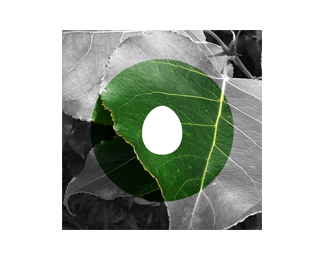
ReplyThanks for all the input guys. In regards to the leaves, they're not necessarilly gone - more testing the waters without them. I'm currently exploring ways to present the leaves (both digitally & on paper)...I'm considering a deep green (tonally equiv. to the brown, something to 'announce' that they're in the mix, but not noiticable straight away). I'll let you know what I come up with. Thanks again.
Reply"it would be nice if we could comment on the variations too"
Hey David...Not to be a pain, but that would be cool. :)
I like this forms very much, but not like this color scheme. Sorry)
Replynice love the egg in midle
Reply@LadyGrey No problem :)
Reply@Yeah just like eggy in a basket :)
I prefer the original one you did, due to the unique leaves as others have pointed out. I think this version reminds me of this: http://logopond.com/gallery/detail/22655
Replywhat kind of egg is this? :D
Replylove the concept!
Well done!
Would it be possible to make the aperture (hole) egg-shaped? Then it would work on a white background.
ReplyIf you really want to include leaves how about introducing it across another touchpoint, perhaps through the stationary or on-line? I don't think you need to compound everything into the one logo, maybe you could have two symbols and a logo-type.
ReplyI also think it might be worth breaking from the usual convention of type and mark lock-up and going for a logo-type and symbol scenario.
ReplyThanks for taking the time to comment everybody, I'll start from the top.
ReplyGareth - Thanks for the link, I definitely see what you mean. Including the leaves in that context does differentiate the two.
Szende - Thanks! The egg represents birdlife as a collective, it isn't specific to a particular species or variety.
David - He does :)
Roy - I did try that earlier down the road & to be honest it looked kinda wierd, but, having a revisit to it (and maybe other avenues) couldn't hurt.
Another idea I was giving thought to last night, specifically for print application - having the egg as a die cut.
Richard - I really like the idea of bring in other elements across the branding platform rather than 'busy up' the logo - I do feel that there could be more done to increase the distance from the image the Gareth linked.
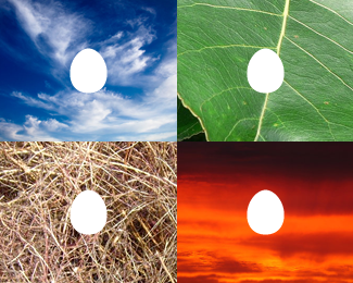
I have some images that I was experimenting with late last night(I'll add to the variations shortly).
Well I have to admit your keeping us all interested. That's a good thing.
ReplyThanks Mike, at the end the day that's all the matters - a good, compelling talking point :)
ReplyVariations are up;
1. I dug up the early 'Egg Hole' version, it could still be refined greatly, but in my opinion, it just doesn't balance on the vertical axis.
2. Experimentation with portraying the 'atmospheric' nature, I would implement these as embelleshments through the web & print collateral, theoretically, they could be used as sub-brands.
3. Same as 2, but with the aperture removed, stripping the idea down to the base egg which could either be white or a die cut.
I would recommend you to keep it simple Derrick, black and white (:
ReplySimplicity is subjective :D
ReplyPlease login/signup to make a comment, registration is easy