Description:
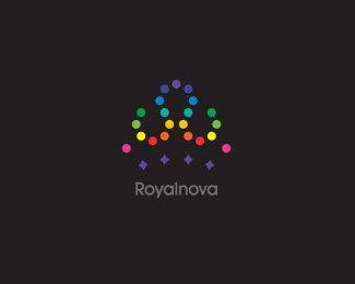
For a meteorology/topography company...The mark is based on the basic form of a crown whilst the colour scheme is derived from temperture markings & terrain codes.
Collab with Jeynelle Dean.
Status:
Client work
Viewed:
9738
Share:



Lets Discuss
Cheers for the floats all :)**Does the type show up o.k on everyone's screen?
Replythe type is a little faint. if you are putting it on a black background, why not knockout the type? %0D*%0D*The crown is somewhat hard to see, I wouldn't have known it was a crown unless I read your description.
ReplyCheers George :) Yeah I was a little concerned about that, all of the screens %26 prints I've checked have been fine...just wanted to make sure. The type treatment is a work in progress, but their only 'hang-up' was to keep it dark.**I really wanted to keep the crown form a little ambiguous so it can allow the viewer to visualise other forms :)
ReplyI'm not sure I like the combination of four pointed stars with the circles. maybe change out some of the top circles to stars? I would make them all circles or all stars myself. if you increased the text just a little, that would make it easier to read. or a bit lighter of a gray tone would do the same. I understand them wanting to keep it dark.
ReplyThanks for the comments!!**Yeah type treatment was a challenge on this one, I would've preferred a little more breathing room in the kerning...but, this is what they signed off on.
ReplyPlease login/signup to make a comment, registration is easy