Merce Hydro
by HayesImage • Uploaded: May. 03 '12 - Gallerized: May. '12

Float
(Floaters:
30 )
Description:
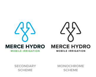
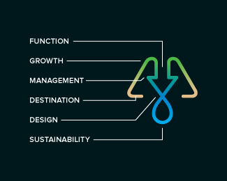
Final design. Merce Hydro, a mobile irrigation company based in Northern Victoria, Australia specialise in redevelopment of drought effected areas for the purpose of farming & residential properties. The Mark is based on the use of a water drop, an arrow, pipes & finished off with an M. The arrow symbolises function & the arrow/drop cross section symbolises design - both core factors in engineering & invention of their systems. Green represents growth, their aim. Brown represents destination (drought area) their market. Water represents sustainability, their long term plan, and finally the pipe represents management, their ongoing analysis & monitoring of their network.
Status:
Client work
Viewed:
11255
Tags:
Gradient
•
Monogram
•
Environment
•
Growth
Share:


Lets Discuss
Really nice one, man! :)
Replygood stuff, josh. love the choice of colors and mono line mark. the only thing i question is the arrow pointing down... i'm sure you thought about this, but perhaps it might give a negative connotation? either way, well done.
Replyon second thought, i think it works. especially because it's dealing with irrigation which is underneath and followed by a water drop. forget what i said above.
Reply^ dear god.
Reply@Breno - Thanks Mate!!!
Reply@Colin - It is a valid question, though. I did test out the logo to make sure it wasn't viewed that way, but as you said, water pipes are constructed under ground level.
This isn't Merce in shot, but heres the general idea; http://titusig.com/wp-content/uploads/2012/01/GSE_Studliner_0005.jpg
Thanks :)
@David - Lol !!! I'm not going to ask about 'destination' then ;)
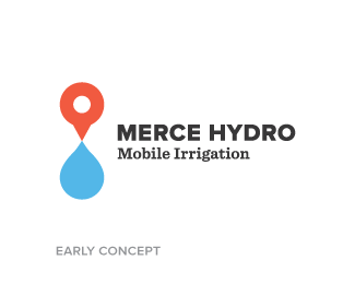
ReplyI have to say that the orange (map point thingy) is very intriguing. In fact I like it more myself.
ReplyI wish I could vote on that one too :)
ReplyNice solution, and colors looks nice together:)Love it:)
Reply@Mike - Yeah, that one was a tricky one, I did develop a few versions of it but the message just didn't get through; http://drbl.in/bTdE , http://drbl.in/bUor & http://drbl.in/bYlM
ReplyI think it's due to the map pin becoming more a symbol of phone app world, google maps, four square, etc. Rather than a representation of location in the physical world. I'm glad you like it :)
@Deividas - Thanks!! It was a hectic brief :)
Love how many elements you were able to include in the mark without it looking too busy. Nice one, Josh.
ReplyDamn you David for supplanting that image! I didn't see that until I read your comment. Now, sadly, I'm finding it difficult to see anything else :[
ReplyAt any rate, *pushes that horrible visual as far away from conscious thought as possible* I really dig the amount of information that's conveyed in such a simplistic mark. I think the mark alone has tremendous potential as a symbol that would be found stamped or etched into irrigation equipment.
I do feel like the high concept behind what all the various colors represent in the gradient version is completely lost in the 1-color versions, but I don't think this affects the mark's overall effectiveness. It still reads as "pushing water," which is essentially what irrigation is all about.
Solid, symbolic mark, Josh.
@Kev - Thanks :) I'm glad it's not too busy, as I still wanted to keep the idea of 'flow', too many elements would create 'blockage' - something unwanted on the subject of pipes & plumbing.
Reply@Jon - Hehe :) That's exactly what I always try to convey, a simple way of saying a lot...I'm not interested in making a logo look like an M.C. Escher print unless the brief specifically mentions something along the lines of "breaking the misconceptions that one can view all 3 dimensions from an exterior plateau and/or form a secondary viewpoint from their own perception of the universe, etc". So I'm chuffed that got through.
In regards to the 1 colour versions, I do understand there is some conceptual drop off, but they will be used sparingly, with how well gradients transfer to print these days. With that said you're correct that there will by some laser cutting (effectively a monotone image) into some well heads, filters & valve heads, fittings, etc. Depending on budget, the earth-moving equipment will get the full colour treatment :D
Thanks bud!!!
Great work bud!
ReplyThanks bud :)
ReplyAbsolutely nailed it Josh! A unique mark with a very compatible type choice. And fantastic use of the gradient.
ReplyThanks Norm :) Typeface is Proxima Nova by Mark Simonson Studio. I'm glad the gradient was such a success, as I don't like using them for mere aesthetic - I'll only use them if there is a conceptual reasoning behind it.
Replycool man!!
ReplyPlease login/signup to make a comment, registration is easy