BPO
by richardbaird • Uploaded: Mar. 14 '11

Float
(Floaters:
27 )
Description:
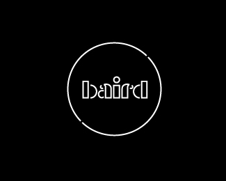
Logo for my blog site BP&O - Branding, Packaging & Opinion. The logomark is designed to be a new letter and is a combination of B,P and O while the circle represents the global aspect of the work reviewed.
As seen on:
BP&O
Status:
Client work
Viewed:
5156
Share:


Lets Discuss
Nice logo and blog mate! Good luck with it!
ReplyThanks Alen, really appreciated.
ReplyLooking great, man. I don't think you need those diagonal lines.
ReplyYep... clean and clever.
Replylove the mark and nice blog, I will have a look into your articles :)*
ReplyThanks for the comments, the diagonals are just the background to the blog which I think are OK, maybe in this presentation its too much so I will re-do it. If anyone wants to contribute any articles they are more than welcome :)
Replygood luck with the blogging richard
ReplyThanks Thomas, It's pretty hard work writing and researching everyday and doing all my client work too but its enjoyable none the less, hopefully people are enjoying it.
Replythis is good. very clean looking.
ReplyNice logo and blog richard, you have a new follower.
ReplyThanks hyperborea, thats really appreciated!
ReplyThis totally rocks. Awesome self-branding.
ReplyHow I missed this? Simple and smart.
Replysimply brilliant
Replysimply brilliant Richard
Replylove it simple nice and with idea
ReplyPlease login/signup to make a comment, registration is easy