Description:
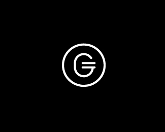
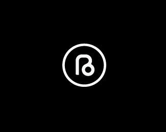
Although I can't write much about the project (as it's still in development) these two initial concepts resolve the aspect of financial donations (designed to be a brand specific currency symbol that draws inspiration from across the world), charity and equality (the use of the = sign to represent the resolution and balance of an often complex sum of individual parts) and the company's global and sutainable aspirations (the roundel as a globe and a continuous cycle).
I intentionally used a monoline weight to represent a consistency of service and avoid it from becoming superflous.
The mark has a lot of internal space as it will need to function across other branded products allowing the corporate colours of partners to shine through it's circular frame. Essentially it's designed to be symbiotic yet distinctive.
Status:
Unused proposal
Viewed:
8383
Share:
Lets Discuss
Nice, it does feel like a currency symbol.
ReplyPlease login/signup to make a comment, registration is easy