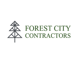
Forest City Contractors
by broman • Uploaded: Jan. 29 '15


Float
(Floaters:
1 )
Description:
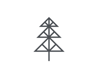
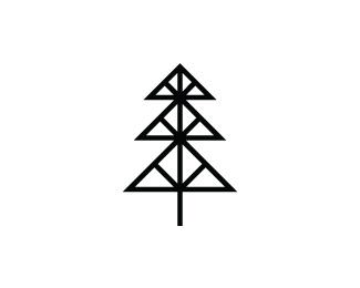
Branding and logo design that was done for a small start-up contractor company in Rockford, IL (a.k.a. "Forest City"). Forest City Contractors asked for their image to be "strong, honest, simple, friendly, and trustworthy" in the eyes of their clients. The small-town company retained that particular charm that is undoubtedly irreplaceable. A nice riddle of city vs. natural mood and making them work together was a nice creative roadblock thrown into the mix since the start of the project, but crucial to the branding direction. (Who says they can't work together!?) A strong, stable visual of a single tree in grey steel color needed to reinforce the structural beams that create the logo. Everything is sound and orderly in contractor work such as theirs, so making every bit of the logo as "stable" and planned as possible. Having a background to represent an green abstract forest visual alongside wooden imagery to reflect the materials used really brings the forest into the city. Altogether, the balance of elements works perfectly as no particular part of the design overpowers another.
More about this branding in the link.
As seen on:
Behance: Dale Broman, Forest City Contractors
Status:
Client work
Viewed:
1602
Tags:
lines
•
city
•
building
•
structure
Share:


Lets Discuss
Please login/signup to make a comment, registration is easy