DB
by broman • Uploaded: Jan. 29 '15


Float
(Floaters:
1 )
Description:
Personal brand logo design. (It's totally not self-centered at all if you talk about your own logo, right?)
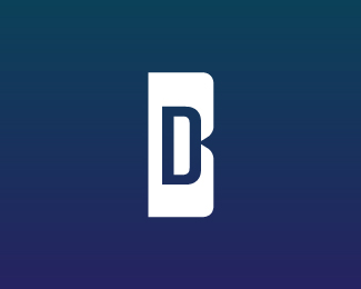
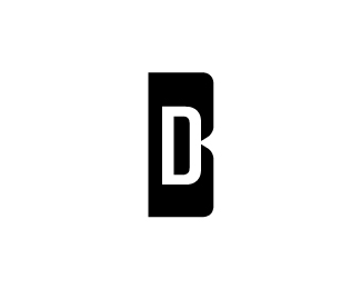
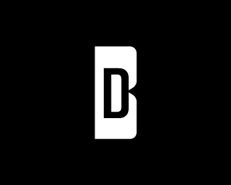
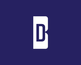
My first initial was made intentionally smaller inside the larger "B" shape for the reason that family defines who we are, yet the "D" space is the most prominent element. Without family, we are nothing - the negative space. That concept is something that unites us all and we don't necessarily give it daily thought. Let it be a subconscious reminder of why we do what we do.
Two types of blues isn't something one notices at first and is an optional gradient effect that was added. One blue tends to lean somewhat toward a flatter "corporate" direction while the other being slightly more vibrant. The intent is the expression of my own meticulous attention to what seems like subtle & obscure details, unseen to those not observing; a small duality on a monolithic symbol hidden in plain sight.
As seen on:
Behance: Dale Broman
Status:
Client work
Viewed:
1218
Tags:
awesome
•
blue
•
letter
•
initial
Share:


Lets Discuss
Please login/signup to make a comment, registration is easy