glaze
by atomicvibe • Uploaded: Jul. 26 '11

Float
(Floaters:
40 )
Description:
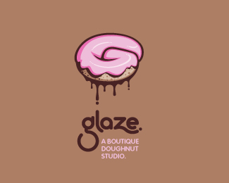
Logo for a trendy, metropolitan bakery that allows customers to glaze and decorate their own unique doughnuts. I wanted this to look really tactile, gooey, and sweet - like you really want to take a bite. Type for "glaze" is custom, and reflects the roundness of a doughnut.
Status:
Just for fun
Viewed:
10356
Share:
Lets Discuss
mmm that looks tasty and moist! haha :) Love the feel you gave the donut. If I may say something, not that relevant, at first glance the shape didn't quite feel that %22donuty%22, but grew into me nonetheless.
ReplyI would love to see some sprinkles on this baby!
Replylike it. maybe text could be better but it's just my opinion %3B)
ReplyThanks for the comments and floats, guys!*@Marscall, the shape is supposed to be a combination of a doughnut and the letter G. Is that nit coming across?*@Sam, I thought about adding sprinkles, but I wasn't sure if it would look too cluttered or not. I'll give this a try and see. *@qyper, what about the text don't you like? Is it the typefaces or the the way the tagline is off-center?
Replydon't you dare change that type!! it's fantastic!
Replyclean work ...really hard candy this one !
ReplyNice one, I want eat it :-)
ReplyHa, nice one! The frosting looks delicious! By the way, I saw your business cards on Creattica and they look great!
ReplyI did a version that uses slightly modified type: http://logopond.com/gallery/detail/142748*What do you think? Does it add anything to the design?
ReplyThanks for all the comments and floats, guys! I really appreciate you checking this one out.*@Nathan, originally, I really wasn't going to change the type%3B I was just curious about what qyper did'nt like about it. See v.2 (link posted above). What do you think about that?*@bernd, %22hard candy%22 - are you referring to Madonna's album cover or the women's nail polish brand? Or something else?*@Raoul, thanks man! Yeah, me too!*@Sean, thanks for all the nice words, man! I appreciate you taking the time to check out the biz cards :)
ReplySorry to triple post, but I wanted to share my Flickr set for this one: http://bit.ly/n28R5i*In it are some initial sketches as well as some color options. Sam, I tried the sprinkles, but I thought it cluttered up the design. Instead, I did one that uses %22funfetti,%22 which is a LOT cleaner than the sprinkled version, but I'm not sure about it. I think it's too much. I really want this to look sleek and metropolitan, like a trendy bakery you might find in Manhattan, and I really like the cleanliness of the doughnut with just the glaze.
ReplyYeah, you're probably right.
ReplyAlthough the funfetti version looks really cool, i think the best way is to keep it as it is, as you mentioned. On the other hand, the second version of the type is amazing, i really dig it, but it has a high icon value, and i think it would be too much for the whole logo... i dunno, i think it works fine alone...**About the shape, yes the G comes right upfront dont worry :D, what i meant was something more %22blended%22, like if the middle part was more curvy, like a spiral. Just an opinion though
ReplyThanks for your input, Martin. Yeah, I see what you mean about the type in the second version being iconic in its own right. However, I think it does stop juuuuuust shy of being too overdone to accompany an icon. Honestly, I have an inclination to develop an alternate version of the logo - an all type execution - that pulls in some of the gooey, drippy, glazed elements found in the doughnut.
Replythis one's really nice on the eyes. sweet lookin, literally! kind of reminds me of graffiti style work, which i love :) gj
ReplyHey, thanks for the nice comment, Ken. Yeah, I can see a bit of the graf style in this.
Replygive me a bite man....love it!
ReplyThanks, Hanuman!
ReplyI like this! Nice work.
ReplyNice one ... Like it!
Replyit's great, it's splendid, wonderfull!!
ReplyMy favorite piece from you Jon.
ReplyPlease login/signup to make a comment, registration is easy