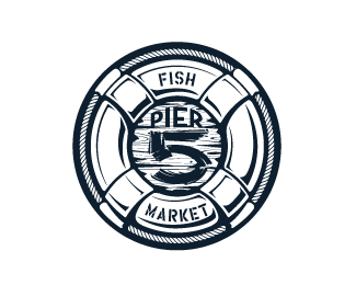
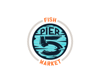
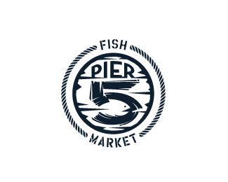
Pier 5 Fish Market - full color
by atomicvibe • Uploaded: Aug. 12 '11 - Gallerized: Aug. '11

Float
(Floaters:
77 )
Description:
Maximalist and illustrative logo for a fish market that captures the spirit of the nautical and maritime aesthetic. There is a fish shape in the negative space within the bowl of the number 5. Type is custom for "Pier" and also the number 5, which is hand-rendered to look like it was painted on a wooden sign with a very wide, worn-out, thick-bristled brush.
Status:
Just for fun
Viewed:
15428
Share:
Lets Discuss
both varieties are great
ReplyThanks so much for the nice comment and float, Bernd!
ReplyWOW! Love it...
ReplyCool concept! Lots going on but it all comes together nicely.
ReplyVery cool, that fish in the 5 is clever!
ReplyWOW, thanks so much guys for all the warm words, floats, and lightning-quick gallerization! I really wasn't expecting that. Thanks, David!*@Lumavine, LOL, yeah, I really wanted to put everything but the kitchen sink in here, but I figured I'd stop at the life preserver, rope, wooden sign, custom type, and negative space gimmick :D I kept getting ideas of more things to put in here, and I physically had to tell myself, %22NO MORE.%22 But, as maximalist as this is, I really do think it helps give the viewer a chance to casually discover the fish, without being hit over the head with %22THIS IS A NEGATIVE SPACE GIMMICK YOU ARE EXPERIENCING.%22*@Sean, thanks, man! I really wanted the fish to seem to appear naturally, rather than looking too forced.
ReplyYou captured the look you were looking for, it looks GREAT! I love the colors.
ReplyThanks, Antonio! Appreciate you stopping by to give a look.
ReplyThis is really quite amazing. There are so many subtle things happening that come together in a really brilliant way.
ReplyWow, thanks for the compliments, Sam!
Replythe one color is just as solid as the full. this is golden work! sad I missed the fish until I read the description though haha. love it.
ReplyI saw the fish :D very clever :D
ReplyThanks, Andrew and Ashley! I appreciate you guys taking the time to check this one out.
ReplyCool logo!
ReplyThanks, Daria! I've been liking a lot of your work, too. You've got a really impressive showcase!
ReplyLovin' this! All fits like a solved puzzle... B-)
ReplyThanks for the comment, Hertz!
ReplyThanks, logo design!
ReplyWow, you surprise me every time!
ReplyThanks for the nice comment, Antonio! Hey, when are you going to upload more logos? You've got really great work%3B I would love to see more!
ReplyNice job!
ReplyThanks, Tiago! Hey, I've seen your business cards all over the Internet. Gotta love letterpress!!
ReplyLove the subtle fish :)
ReplyThanks, Mike!
Replyvery nice man!!!
Replythe 5 is really nicely done! love it
ReplyExtraordinary work. Very nice!
ReplyWhat a nice comment, Zoya. Thank you!
ReplyLove the 5 number and and the illustration technique! great!
ReplyThanks Luka!
ReplySorry Gary... somehow I missed your nice comments earlier. Thank you so much!
ReplyGreat logo !*beautiful fish
ReplyThanks for checking this out, Michal!
ReplyCool!
ReplyStill like this version out of all of them. Fish is subtle and not in ya face. Great work mate.
ReplyThanks for the comments, klimsan and Norman!
Replywonderful work
ReplyThanks, James! I appreciate the nice comment.
ReplyGreat illustration, I like the fish inside 5!
ReplyThanks, Radek! Glad you saw it!
ReplyMissed this one ... nice work!
ReplyWhen I saw your logo I really liked.Now seeing that you show your process I just loved it %3D)
ReplyThanks, Jeff %26 Shadz! I appreciate you guys checking this one out :)
Replythis is awesome, i didnt even notice the fish until i read the description, a nice little easter egg.
ReplyThanks for checking it out, Brian!
ReplyI really like this logo.
ReplyThe wood texture is great.
Thanks for the support, Bruno!
ReplyPlease login/signup to make a comment, registration is easy