First Pres church logo - black
by atomicvibe • Uploaded: Apr. 25 '12

Float
(Floaters:
32 )
Description:
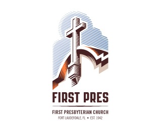
Redesign of the church's old logo http://bit.ly/FP-old in a stylized, illustrative manner, making it more welcoming, contemporary, friendly, casual, & upbeat. Client specified a rendering of the church’s architectural arch and cross in the perspective in this photo (http://bit.ly/FP-arch-cross), and required an emphasis on the church's nickname, “First Pres." In this concept, crisp, exacting vectors emphasize the architectural soundness of the church — a metaphor for the concept of faith as the solid foundation in one's life. This logo makes use of hatching to add gradient dimensionality. Click here for more images, detail, and full design rationale: http://bit.ly/FP-case-study. Also, check it out on dribbble: http://bit.ly/FP-dribbble
Status:
Client work
Viewed:
9115
Tags:
church
•
religion
•
religious
•
cross
Share:


Lets Discuss
Black version.
ReplyDang, your line work is killer.
ReplyThanks for the nice comment, Sam! Appreciate it, man.
ReplyI really apreciate line works. Great job here.
ReplyI preffer the black version.
Hey Bruno, thanks for the kind words! Really appreciate you checking out my work.
Reply=O
ReplyLike this one too ;)
ReplyCheers, Mike.
ReplyPlease login/signup to make a comment, registration is easy