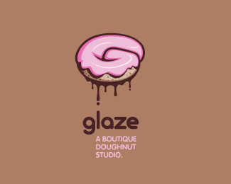
glaze v.2
by atomicvibe • Uploaded: Jul. 27 '11 - Gallerized: Jul. '11

Float
(Floaters:
137 )
Description:
Logo for a trendy, metropolitan bakery that allows customers to glaze and decorate their own unique doughnuts. I wanted this to look really tactile, gooey, and sweet - like you really want to take a bite. Type for "glaze" is custom, and reflects the roundness of a doughnut.
Status:
Just for fun
Viewed:
30909
Share:
Lets Discuss
someone had mentioned on the first version, add some sprinkles. Definitely digging on this though. Looks super tasty.
ReplyThis type is better. Still wanna see some sprinkles.
Replyyeah! really like this! The thing about the type i was mostly talking about before was the stacked subtext and how it's lined up with the 'l'. Glad you kept that %3B) **Also on another note, I looked at this just now on one of my monitors where the color calibration is wrong (saturation is too high in warm colors) but MAN it makes the donut look sexy! it literally adds that last 'glaze' to the donut! I wish I could show you what I see! Please please try pumping the pink on the donut! I promise it really does help!**Great work!!
Replytasty!
ReplyGlad you guys like the revised type!*@Todd, thanks for checking this out, man! I appreciate the comment.*@Sam, LOL. OK... FOR YOU, I'll try the sprinkled version. Honestly, I started working on it and thought to myself, %22Looks like pubic hair.%22 D: However, I really only gave it 5 mins. and decided to abort. I'm sure with a bit more time, I could get it looking less pubey-like :D*@Nathan, try not to lick your monitor. Eh, what do I care, LICK THAT THANG! I'll try playing around with the pink on this, but I don't want to overdo it. I feel like the pastel colors give the doughnut a nice, glazed sleekness that might be lost by saturating the color too much. I definitely don't want it to look like crazy neon frosting you might see on a kid's birthday cake.
ReplyThanks for the comment, orca!
ReplyYou got some skills mate :D looks ready to eat to me, I do agree with the sprinkles but I guess this is your take on the doughnut :D. I wouldn't be surprised if this got put in the gallery :D
ReplyPretty type, and in a lot of ways I like it... but %22g%22 looks too close to an %228%22. Also, lowercase %22g%22 doesn't set off the %22ah-ha%22 moment of noticing the G-shaped dough. Great graphic work, though. Hope I don't see this wind up on BS. It's too lovely.
Reply@Ashley, thank you for the compliment! You too with the sprinkles? Haven't you people ever eaten a glazed doughnut without sprinkles? LOL, OK, OK, that's 3 requests (I think) for sprinkles. I promise I'll give it a go later.*@JF, thanks for your honest crit. I see what you mean about the G/8 similarities. I'll see if there's another way I can salvage the idea of having such an exaggerated descender bowl on the G without it looking too much like an 8. Re: lowercase VS uppercase G, I definitely get what you're saying, but I was thinking the opposite. I feel like an uppercase G is the expected way to establish that relationship, and doesn't allow for any discovery. While it might help those few who look at the doughnut blankly and wonder why its disfigured, I think the switch in case causes more of an A-HA moment, because the viewer hasn't already made that connection. They see the doughnut (hopefully as a doughnut), then they see the name, and then go, %22Oh, it's a G. G for GLAZE.%22 At least I hope that's the psychology involved. I dunno. Maybe I'm hoping for too much.
ReplyOh, and to address your comment about BS, no way. I tried BS a while ago and got frustrated with the approval process, so I gave up on it. All these logos I'm posting on LP labeled %22Just For Fun%22 truly are just for fun. They're exercises I do in an attempt at staying sharp and developing my skills. I'm constantly thinking of new brands (or ways to improve existing ones), so these hypotheticals are a good way of exploring all those ideas.
ReplyThanks, atomicvibe. I like the lowercase g... so perhaps the way to keep its grace and distinguish it from the appearance of an 8, Is to have the assumed end of the g -- tail, if u will -- curl slightly. Instead of re-connecting with the %22head%22 of the lowercase g, have it curl slightly, not too much, curl inwards like a snail shell or cinnamon bun, but not too much. Just enough so the curl of the dough can fit with it better. And also to prevent the %228%22 look. That might help accentuate an already fabulous graphic. Also...I really like the other type as-is (other version).
ReplyThanks, JF! Prior to reading your last comment, I took a stab at modifying that G: http://bit.ly/nV64kg
Reply*updated with a modified G*
Replythis looks perfect now..
ReplyYummy!
ReplyI love the highlight on the glace itself. Really brings it to life. Well done atomicvibe.
Replythat's a real tasty design, Jon! great type as well :)
Reply%5E%5EAnd by glace, I meant glaze.
ReplySweet!
ReplySweet, im hungry now
ReplyNice one :)
ReplyLooks very tasty. I would definitely buy those doughnuts :)
ReplyBeautiful and clever illustration!
ReplyOh wow, I just saw that this made the gallery. Thanks for all the wonderful comments and floats, guys! I'm really happy with the way this turned out, especially with the revised type. And yeah, after having looked at this for a few days now, I really want a doughnut (or 12).
ReplyLooking good, Jon, like that type!
Replyyammy
ReplyGlad to see this one in the gallery. Well done mate
ReplyThanks Sean, Andrew, and orca! I appreciate all the love on this one :)
ReplyIt's too organic
ReplyIt's too organic*But type - it's good!
ReplyI think I put on 2 pounds just looking at this. Well done.
Replyi'm going straight down stairs to buy a coffee and donut. thank you!
Reply%5E *doughnut
ReplyI love the type, nice job! I'm not sure the logo will reproduce as well as it could though? It also won't look great grayscale which can be a problem Although it is fictitious so to hell with that, great job!
ReplyThanks for the comments, guys. Vos, sure, this full-color version may not be the best for reproducing on, say, a fax, but I assure you, I've played around with this logo in 1-color, and it works. You lose some of the extra shading, but the mark is still identifiable as a doughnut/G. But like you said, this is a fictitious logo, so there's no need to obsess over all that.
ReplyGreat execution on the illustration of the G lettered Doughnut. Real Tasty.
ReplyIt's delicious! Bravo!
Replythe z letter is nice and now am craving doughnuts*
ReplyThanks for checking this out, guys! I appreciate all your kind words and floats. And yes, I've been craving a big fat doughnut, too. I had a few bites of cake last night, but it just wasn't the same. There's just something sinfully delicious about sugary, sticky, sweet, glazed, fried dough.
ReplyJon, where are the cops? Nice doughnut :)
Replygreat great illustration, concep, execution ... flow !
Reply@Jovan, LOL! I think a cop would impregnate his trousers from looking at this thing.*@Bernd, thanks for the nice words, my man!*Cheers to all viewers and swimmers. I'm really feeling the love, guys!
ReplyYou just made me hungry :)
Reply%5ELOL. How do you think I felt while creating this? I felt like Homer Simpson, having some sort of doughnut withdrawal symptoms.
ReplyRecent news for my lil' glaze logo:**- Slated to be published in the upcoming book, 'Logonest 02,' January 2012.**- Received Logo of the Month, August 2011 over at The Logo Mix:*http://www.thelogomix.com/blog/logo-month-august-2011-11083135.html%23comment-2828**- And finally, it has recently been purchased! I can't yet reveal anything about the company, but you can check the final client spec sheet on my Flickr page, which details all the various %22flavors%22:*http://www.flickr.com/photos/atomicvibelogo/6147574006/in/set-72157627294260520
Replybadass man! congrats on the sale! hopefully you get free donuts for life?
ReplyThanks, Nathan! Unfortunately, there will be no free doughnuts in my future. The company that bought it is tech-related. That's all I can say!
Replycool!*sounds interesting
ReplyReally nice illustrative logo. Love it.
ReplyGod damn, this is beautiful.
ReplyThanks for the compliments and floats, Louis and Chris!
ReplyHey guys, check out my glaze logo interview over at Logogala, which will give some insight into the creation of this:**http://www.logogala.com/gallery/details/glaze/
ReplySomeone needs to open shop and use this. It destroys.
Replynice, man. delicious!
ReplyThanks, Ryan %26 Steve! I appreciate the feedback. Sorry for the t%FCrbo-late response.
Replythis logo is so good i want this place to exist so it can be used.
ReplyThanks, Ehsaan. Actually, it *is* in use, just not for a bakery. A mobile/desktop back-end app hosting/framework start-up bought it several months ago: http://www.mobilefrosting.com/
Replycongratulations for your award in Brands of the world.
ReplyThanks, Rick! I still can't believe I won!
Replygreat design ! i love how the doughnut forms a 'G' and the highlights and shadows on the pink what makes it seem even more real !
ReplyThanks for checking this out, Yannick!
ReplyBOOYA! you reached a tonne! well done fella. just realised i hadn't floated this bad boy. here's to 101
ReplyYou rock, Matt! Thanks for the float, bud.
ReplyHey, Jon, thanks for gerat help!!! Your work always inspiring!
ReplyYou bet, Gary. Thanks for the kind words. I am a fan of your work, as well. Did you arrive at a solution to your recent design conundrum?
ReplyNice execution using little effects to show that slurpy, drooly donut :D
ReplyHey man, thanks for checking this out!
ReplyThanks for the kind words, Thierry!
Replyreally clever and well executed.
ReplyThanks again for the love, Rahul!
ReplyGreat tipography
Replythis is great,i am from greece and i open a donut shop how can i use it?
ReplyBy far my favorite logo you've created Jon! Simply amazing, I want a donut now, with pink frosting. LOVE IT!
ReplyPlease login/signup to make a comment, registration is easy