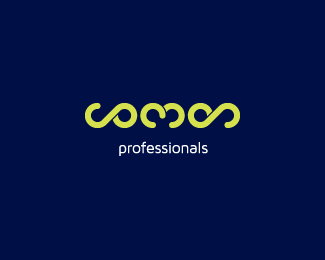
Description:
Liking the cobode logo i designed after viewing it on behance, a client from a different continent and completely different business type requested a logo with a similar style.
comon is a portmanteau using the words consulting and monitoring.
special thanks to joeprince for
maven pro and google for the word portmanteau
Status:
Client work
Viewed:
6671
Share:

Lets Discuss
Hey Matt. I remember you telling me about this one. How do I say it - flipping good! And surprisingly legible.
ReplyThat's a very creative concept.
Reply@ Simon... thanks mate, it's good to hear because it was my only concern. *@ Pierro... champion! thank you kindly
ReplyI really like your style and the work you've done. I looked through many of your logos presented here and I got especially inspired by seeing your own 'growth' during last few years.
ReplyAbout this concept...when looked at it in your profile - I tried to find 'cobode', as I've seen a few times there. I read it as 'comon', and got a bit baffled (thinking about the word 'common')so I decided to read the description.
I wrote this paragraph just to tell you that is greatly legible and seen just the way you meant it be.
Looking forward to see more of your works!)
Please login/signup to make a comment, registration is easy