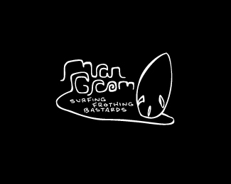
Mangrom
by VERG • Uploaded: Mar. 23 '11

Float
(Floaters:
5 )
Description:
A rebrand idea for my mangrom surfboards.
Waves and city scape incorporated into the hand written type.
The idea behind it is to hopefully cross over into doing some t-shirt designs with the brand that aren't so "cartoon-like".
still working on the by-line
As seen on:
Behance
Status:
Work in progress
Viewed:
2340
Share:
Lets Discuss
LOL! Love the by-line! Classic! :-D
ReplyYeah, this one's my favourite of the 3 you've put up. I can definitely see it as a T-shirt. Legibility is good - maybe just the 'r' might be confused for a 'c'? With URL's top of mind, one could see 'com'?
Replycheers buddy... this is mine also. thanks for the feedback... i agree with you the type needs a little attention around the 'r'. I also see .com. will look into it and repost.
Replycool. and put my order in for the t-shirt so long! %3B-)
Replyit's in the mail fella
ReplyPlease login/signup to make a comment, registration is easy