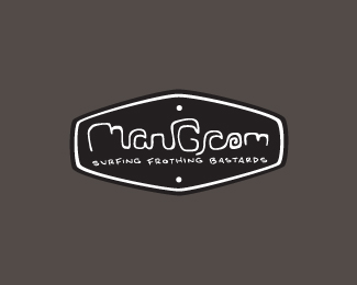
mangrom
by VERG • Uploaded: Mar. 24 '11

Float
(Floaters:
7 )
Description:
A rebrand idea for my mangrom surfboards.
Waves and city scape incorporated into the hand written type.
The idea behind it is to hopefully cross over into doing some t-shirt designs with the brand that aren't so "cartoon-like".
still working on the by-line
As seen on:
behance
Status:
Work in progress
Viewed:
2763
Share:
Lets Discuss
Nice one. I like the little waves you've incorporated into the type.
Replythanks josh! i might be treading that fine line between it being legible or not
ReplyHey Matt, I'm digging the leash!
Replycheers fella... i dig the leash too. super light comp leggie
ReplyPlease login/signup to make a comment, registration is easy