Description:
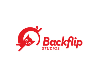
Proposal for Backflip Studios who creates app games for the iOS and Android systems.
As seen on:
Sean Heisler
Status:
Work in progress
Viewed:
9068
Share:
Lets Discuss
nice fresh looking logo, Sean.
ReplyThanks, Mike, always good to hear from you. Trying to convince the client to go this route.
ReplyLooking for criticism if anyone has any thoughts. I thought this type worked well with the mark, any thoughts?
Replyvibrant colors, sean...kind of makes me hungry. i think the type fits well with the cat and the movement having it slightly tilted like that. the 'fl' ligature is a nice touch as well. this is just a personal preference but i always considered cats with sharp eyes like you have here, evil. maybe round out the eyes a bit for a friendlier more welcoming kitty? unless you want the kick ass ninja cat, then you are spot on. one more thing, is the spot below the eyes a nose or mouth? whatever it is, i'm not sure it's necessary.
ReplyColin, thanks, I appreciate it! Ironic about the eyes! I debated this over and over and had versions with more round eyes as opposed to the slits and pretty much about flipped a coin in the end. Someone else mentioned ninja and if the eyes contribute to that vibe then going to round may be better as I am hoping for more friendly as opposed to ninja-cat. The spot below the eyes is the mouth but here again I had it up further to look more like the nose as one point and couldn't decide. Maybe I will try losing it like you said or as a nose again. All points taken and glad you weighed in, thanks so much!
ReplySean, The type is a great match, I love the use of the ligatures and the type compliments the flow of the character. I think the movement of the cat matched with the slit eyes creates the black cat effect, that is a cat that is ready to pounce. I would be interested to see the version with less slit eyes to see if it makes a difference in lessening the ninja feel.
ReplyThanks, Ashley! I appreciate the feedback. I will work with the eyes and re-post. Again, thanks!
ReplyRe-upload with tweaks. I changed the eyes from the slits to more round, tweaked the ears a little and went away from inferring a mouth to more of a nose. I think these things helped, thanks! If anyone else has some feedback let me know, won't be offended if you think this sucks. :)
Reply%3BD .... !!!!!!!!!!!!!!
ReplySean? Are you kidding me???? This has a great look! What an dynamic pose and what a mad face look!
ReplyThanks, Deiv! Good to hear from you and glad you like it. I appreciate the feedback, thanks so much. Thanks for the unexpected spot too, wow.
Replysuperb character mate.
Replyone word - FUN. Logo as it should be for games studio. Cool
Reply%22fl%22 works great and the cat position is great. only maybe the details (legs, face) can be more interesting
Replyshylesh, Julius, Giedrius, I appreciate it!*@Giedrius: I agree with you but I kept it very, very simple as they want the symbol to be recognizable very small. They want to be able to put the symbol in the upper corner of an app icon - yes, THAT small. :) So I'm already likely too detailed in some ways.
Replycongrats Sean, awesome design:)
ReplyWicked logo, Sean!
Replymuch better with the white bg sean.
ReplyCongrats Sean!
ReplyHoney kitty
Replynice flying cat
ReplyGreat work, Sean. Funny, friendly, memorable.
Replylove your work sean! all of it.
ReplyDeividas, Josh, Ashley, Alena, Ricardo, Stelian and Dan, thanks a lot, guys!
ReplyQuirky little guy!
ReplyNever seen something so funny.
Replyhaha so funny and cool! )
ReplyPlease login/signup to make a comment, registration is easy