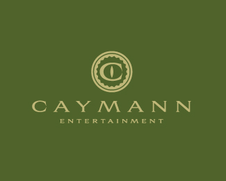
Caymann Entertainment
by SeanHeisler • Uploaded: Feb. 17 '11 - Gallerized: Dec. '11

Float
(Floaters:
91 )
Description:
Unused logo proposal for Caymann Entertainment, a California based movie and television production company whose name is a combination of the two partners and a play on a Cayman alligator.
As seen on:
Sean Heisler
Status:
Unused proposal
Viewed:
8683
Share:

Lets Discuss
Really like where this is going. I think more black on the Belly and less of underbelly to shape the C better and maybe a little less detail might try to bring the legs to ground be more solid. I also don't think you need the type lines maybe solid there. looking good.
ReplyHey, Mike, thanks for the comment. I'm sorry, I should have made a better indication that this is a rejected proposal. All good points you made though and I appreciate it. I never got the chance to perfect it and was bummed they didn't go this way!! They preferred the other one I posted in which they liked the %22seal%22 look and the subtle Alligator eyeball in their symbol. One cool thing though is they are going letterpress that seal. Thanks, bud.
ReplyLove this
ReplyI know Mike is the logo master, but I have to disagree. I think showing the underbelly, and repeating the line motif in the type really give this mark a lot of character. Plus, depicting the underbelly of the 'gator is an unexpected twist. That makes it unique. Nice one. This would've looked amazing leterpressed.
ReplyThanks, Trish and Jon!**@Jon: I pushed hard to get them to go this way but I think they felt it was too whimsical, which is why I liked it, it's supposed to be a bit kooky with the underbelly and awkward disposition of the croc. Glad you like it, Jon, thanks.
ReplyWhat's the nature of their films and TV productions? If they're all sooper-serious documentaries and news, then yeah, I can see why this might be regarded as too whimsical. Nevertheless, it's a great mark. Hey, look at it this way, if the band Cannibal Croc ever approaches you to design a logo, you've already got a head start.
Reply:) I can't recall exactly but do remember them mentioning something about a game show of some sort as a future production. So yeah, I felt the fun quality was good, but they wanted something more like a seal, something a tad more formal, for whatever reason.
Replysweet, Sean.
ReplyGreat work.!.
Replybeautiful Sean ... great work man !!
Replynot bad the green background ... %3BD
Replystunning one*
ReplyWhoa, thanks guys! I appreciate the gallery spot! Yeah, Bernd, I got on here this afternoon and saw it up there and thought, wow, that presentation looks a bit boring. Hopefully this works better, it's more like their brand. Thanks!
Replygreat!
Replyalligastic!
Replygreat stuff, Sean! :)
Replytruly, one of the best logos i have ever seen, glad one of these makes gallery !
Replysweet
ReplyGreat mark, Sean !:)
Replyawesome work buddy:)
ReplyThat's one flexible gator:)*Concept/execution, A !
Replynice job, sean.
Replynice twist on classic. i concur with the first comment.
ReplyReal gem buddy.
ReplyThanks, everyone, I truly appreciate all of your comments!
ReplyWow! Tthese are great tips very useful indeed.
ReplyVery good, man!
ReplyThanks designbee and Alena!
ReplyThis is very cool Sean - really like it.
ReplyReally nice Sean. Love the type and how the fill carries through to the mark. It seems I\'ve missed a couple of your lovelies.
ReplyWow, this is just very very good
ReplyPlease login/signup to make a comment, registration is easy