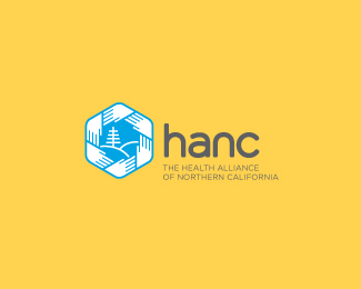
Description:
A government-funded entity that provides a range of services to help improve the health of people living in rural communities in Northern California.
As seen on:
Sean Heisler
Status:
Unused proposal
Viewed:
10738
Share:
Lets Discuss
Nice, lets see type %3B)
ReplyThe mark is great looking Sean. I think it would still be strong without the stuff in the middle, but probably makes it stand out more with them. Want to see some type with it too... :)
ReplyGreat mark, Sean.
ReplyHey, thanks a lot, Anthony, Mike, Joe and Srdjan, I appreciate it! Well (ahem), the font(s) is something the client has given a directive on. :) They want their name as an acronym and again the font(s) are already set in stone. I think it's ok but would not have been my first choice at all. Shall I revert and reload the symbol here instead, like I had it?
Reply@Joe: They are looking to make the mark a bit more unique to them than just the hands, and the tree/mountains help do that. I like it without the hands too, I have a version like that, several actually.
ReplyMight be able to change the typeface I guess! Woohoo! I'll post some type soon. Thanks again everyone!
Replyi'm curious about the type too!
ReplyI like this very much. Well done Sean. But I would love to see a type treatment aswell.
ReplyThanks Andrei and Paul. Sorry for the confusion, folks. The client originally said they had a typeface in mind and were set on using it but talked with them today and they are open to changing it. So, here's one of the typefaces I am proposing. They definitely want an acronym. They are a pretty buttoned up company and so a clean, structured solution seemed fitting which also works well with the simplicity of the mark. I tweaked and modified a font by rounding corners to match the round qualities in the mark.
ReplyOh, and they like lowercase as a possibility.
ReplyReally cool color scheme, you don't see it everyday.
ReplyThanks, javaap. Yeah, I'm pushing for them to consider this color scheme, I think it's very friendly.
Replynice work on this.
ReplyNice one buddy, gratz on the front page (news)! :)
ReplyCool logo, very nice work.
Replyvery nice logo!
ReplyNice execution with the hands and placement of that headline! Kudos Sean.
ReplyAnthony, Ivan, Matt, Hans, Alen, Eddie, David, everyone, thanks so much! Didn't expect this reaction, I'm quite thrilled it made the gallery, wow. Appreciate it!
Replylike color and style
ReplyReally nice concept Sean. Color scheme is great, but mark in my opinion is to large in relation to typo.
ReplyUpdated. Thanks, Jovan. I agree with you. I himmed and hawwed about the size and felt it might be a touch big but given the detail in the mark I opted to weight it just a bit to the symbol dominant side. It's been bugging me too. I brought it down some and I think it feels better now. Probably could go a hair more but I'm striving to keep it from getting too small.
ReplyIMO I think the update helped. Personally agree with you about the size.
ReplyCool, thanks, Matt.
ReplyGreat mark Sean! :)
ReplyThanks, Michael, as always!
ReplyWell, unfortunately the client did not go with this. They opted for the typical - they decided to take another one of my proposals and redesign it themselves. So feel free to float this if you haven't, or buy me a drink, to help ease the pain.
ReplyVery nice! Too bad for the client!
ReplyI like your %22e%22 in your avatar ethereal, Oh, and this logo too :)
ReplyRudy and Saawan, thanks!! The e is a part of a new identity I am working on for myself.
Reply%5ECome on and hurry up Sean, we want to see it already! :P
Replyvery nice- would like to see type squared out more.
ReplyGorgeous.
ReplyChico and Chad, really appreciate it!
ReplyGreat mark. Congrats :)
ReplyThanks, I appreciate the comment.
ReplyPlease login/signup to make a comment, registration is easy