Caymann Entertainment
by SeanHeisler • Uploaded: Feb. 17 '11

Float
(Floaters:
21 )
Description:
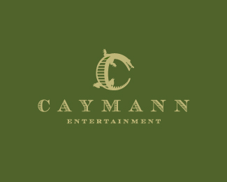
Logo design for Caymann Entertainment, a California based movie and television production company whose name is a combination of the two partners and a play on a Cayman alligator (hence the subtle alligator eyeball in the symbol). Client requested to see one "seal" like concept and it became final. Business cards will be letterpressed.
As seen on:
Sean Heisler
Status:
Client work
Viewed:
3947
Share:

Lets Discuss
That works too. Be a tough letterpress in those fine outer lines though?
ReplyThanks, Mike. I agree! I warned them of that but they took the card and decided to see the printing through themselves. Not sure I will even get to see it. Hope it looks cool.
ReplyMaybe suggest just LPing the center?
ReplyThat is a really good point! Thanks for the suggestion, I will pass that on to them. Didn't think of that, thanks!
ReplyI think you should have just made the outer border solid and the same shape as the center because it reminds me of Alligator bumps. Oh well done deal. See ya Later Alligator.
Reply%5E Ha! No, no, I could run it by them, I like the idea. They haven't done anything with this yet.
Reply...and yes, those shapes are supposed to be reminiscent of alligator bumps, good eye! No pun intended. %3B)
ReplyThis like more! I see eye watching me!
ReplySlick stuff Sean! Love the eye!
ReplyThanks, Agencija and Alen! Glad that is coming through. Conceptually the eye plays into the movie and television production (visual) thing.
ReplyAlso Caymann sea and the entertaiment shark eye %3B-))
ReplySolid stuff Sean.As always:)
ReplyThis one is the winner, Sean! Great job! :)
ReplyThanks, guys!
ReplyReal nice Sean! Got your email btw...still waiting to reply :) Cheers my brother.
Replybloody cool
ReplyThanks, gents! No prob, Joe, take your time.
ReplyRe: letterpress and fine lines, actually, most letterpress shops can effectively print down to .5 pt. rules and about 5 or 6 pt. type. Line work is actually what works best for letterpress. Some shops, like Studio on Fire in Minneapolis, are able to turn out precision results on complex jobs that most other letterpress shops won't even touch, and I think I've seen examples of prints with 3 pt. type.
Reply%5E I modified the design after Mike raised the issue. The lines that were in there were quite tiny. But good points, it is amazing what good letterpress shops can nail. You mention Minneapolis, is that where you are at? I'm in Omaha. Your cool mis-registered style and shape usage would lead me to believe you are in the area! :)
ReplyHey, thanks for the compliments, Sean. Newp, I'm actually in Baltimore, but I have a massive ____-on for Midwest design and letterpress, especially the stuff coming out of Minneapolis. I stalked Studio On Fire for years before I was ready to pull the trigger on my own bizcards. And as a matter of fact, I'm on a major, nationwide full-time job search, and a good majority of the firms I'm looking at are in Minneapolis/Saint Paul. I just might be in your neck of the woods!
ReplyPlease login/signup to make a comment, registration is easy