Description:
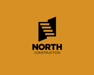
Proposal for a construction company. Symbol is staircase in negative space and abstract "N" letterform.
As seen on:
Sean Heisler
Status:
Work in progress
Viewed:
21847
Share:




Lets Discuss
looks great Sean ... like it
ReplySimple, yet brilliant! I like this one a lot, Sean.
ReplyThanks, guys, I appreciate it!
ReplyWowee. Nice.
ReplyGreat work, great idea!
ReplySam and Peter, thanks so much, fellas!
ReplySimple and smart, very good!!
ReplyNice one bud :)
ReplyThanks Antonio and Josh! Hope that negative space stairway is coming across?
ReplyHey, interesting solution.
ReplyThanks for the comment, Jovan.
Replystrong concept Sean:)
ReplyAppreciate it, buddy.
ReplyThis is great Sean. Nice job champ.
ReplyThanks, Matt, appreciate it buddy!
ReplyExcellent work, Sean!
ReplyHey, thanks, Serge!
Replycongrats sean. as always, well deserved.
ReplyNice, nice work, Sean.
ReplySean, this is great
Replyvery nice Sean
ReplySimply great work
ReplyGood N!
ReplyIt is my great favorite of mine!
Replysimple and nice!!! cleverly done!*
ReplyLooks great
ReplyNice one @Sean Heisler, did you get my reply to your e-mail some time ago?
ReplyThanks all, I really appreciate the comments and floats. Thanks for the gallery spot as well!*@Milosz - Hey buddy, yes, I did and thought I replied again??
ReplyGood thinking :)
ReplyNopes, buddy :)
ReplyExcellent solution! Great one Sean.
ReplySean, I like the concept a lot. Something just bugs me about the N, seems it could be like skewed more somehow to look more like an N. I know it's %22abstract%22 but wonder if it could be improved? I did a North logo also http://logopond.com/gallery/detail/117457 seems there's a way to make the steps end at points?
ReplyOOPS, sorry, guess I critiqued. Nevermind.
ReplyThanks, Mike. You can critique my work anytime. I hear you about the N, I toiled over that myself hoping that it was communicating an N letterform. It is abstract. It's possible that the steps could end at a point but I would have to play with it and your North River mark, which I have always loved, inspires me to try something. If anything, after being inspired by your mark I could foresee taking the upper right and lower left points of the black square and pull them out to make it look more like a %22pointy%22 N. What I do like about this current solution is the simplicity of the execution, it's just simply a black square with the repeated negative shapes/stairs knocked out of the square. Anyhow, I'm intrigued, I appreciate the feedback. Thanks again!
ReplySorry, I know this is already in the gallery but just a subtle tweak here I'm experimenting with. Going from Mike's suggestion and some experimentation I believe this tweak alone actually improves this and retains the simplicity! I think you get a better inference of an N now and from a dimensional standpoint it now appears as if the black area to the right of the stairs is a defined %22wall%22 and what would be the plane of the floor of the upper level and then the space below the stairs looks like a wall below the stairs and then what would be definition of the plane of the lower level.
ReplyGrafiker and James, thanks so much!
ReplyPerfect!
ReplyLooks great Sean!
ReplyMan, this thing is giving me googly-eyes! I love how perception shifts the longer you look at it. Congrats on the well-deserved gallery spot, Sean!
ReplyThanks, guys! I have to give props to Mike for his help here, whether he likes this move I made or not(?), his suggestion made the perspective and sense of depth really pop and I think there is a better inference of an N now too.
ReplyNice one Sean. This is a very strong mark.
ReplyGreat stuff Sean. Agree with Roy!
ReplyRoy and Riz, thanks so much, glad you like it! Actually everybody, the whole damn Logopond,, thanks so much for your support and encouragement!
ReplyNice Sean, I think it has a bit more interest too.
ReplyNice one SH!
ReplyVery nice Sean.
ReplyMike, Joe and Gert, thanks for the comment, glad you guys like it!
ReplyVert nice, love it
ReplyAnother nice one, apparently I missed this in the gallery.
ReplyVery very nice logo!
ReplyIntelligent Logo!
ReplyPlease login/signup to make a comment, registration is easy