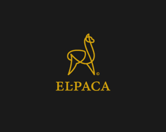
Alpaca
by s7even • Uploaded: Aug. 22 '08

Float
(Floaters:
45 )
Description:
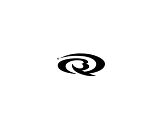
Premium alpaca wool products mark.
Status:
Nothing set
Viewed:
20726
Share:


Lets Discuss
Good one... And you can even draw it in one line (in one draw)... Beautiful!
ReplyVery nice 7!
ReplyReally interesting!
ReplyI like. But where's the monogram?
Replygreat job !
ReplyThanks everyone.. *Apologies gt - monogram was a misnomer.. didn't mean to send you on a wild letterform chase.
Replyincreible, es muy inspirador
Replylogo is really great , really but ...**http://logopond.com/gallery/detail/20815*I think dache deserves for some words under this work
ReplyHi Kwaku - Dache's bull is a great mark (although no surprises there), I was aware of it prior to creating this work although I certainly wasn't consciously referencing it to create the alpaca.*The basis for the illustration was more to create the alpaca from a single continuous stroke in one movement (as type08 noticed) but I definitely wasn't claiming to have pioneered this illustrative style. Felix sockwell and von glitschka both have some great work in this style and I think you will find there are quite a few examples of continuous line-work animals right here on the pond.. (http://logopond.com/gallery/detail/7148).. (http://logopond.com/gallery/detail/24667) *Precedents aside I think the fact that my work describes a different animal and will be used for products made exclusively from this material makes it unique enough to be distinctive/memorable. This style also suited the requirements for the mark very well.. works great in single colour.. reduces well to care label size etc.. plus I am a huge fan of minimalist line drawings so this was a nice challenge and great fun.
ReplyAdd Picasso, no one can claim this style. You did a fine job man. :)
ReplyWow nice!
Replys7even - please don't take it as an attack. I just pay your attention at some points. As I said before logo is really good , great visual look and for sure it is memorable. But I kinda can't fully agree with you. The examples you showed me they're certainly based on the same idea, but more constructed and the thickness of the line is quite smaller. Looks at dache's work (http://logopond.com/gallery/detail/20815) and you will see the execution of your mark is nearer to his design. Even , if David didn't draw it in one line.
ReplyLove the simplicity of this...Nice work
Replynice, very picasso
Replymemorable!
Replynice..dig your work man
Replybeautiful symbol
ReplyI love this.
Replycool symbol
ReplyHi Steve. I’d like to contact you. What is the best email to reach you on? Sophie :)
Replycan I buy this logo from you?
ReplyPlease login/signup to make a comment, registration is easy