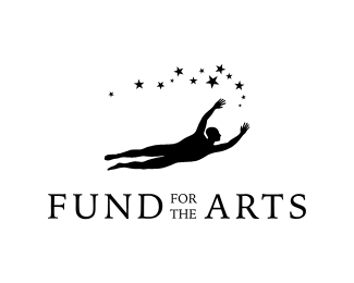
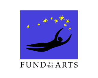
Fund for the Arts
by pineapple • Uploaded: Dec. 17 '08

Float
(Floaters:
2 )
Description:
Organization benefiting arts education.
Status:
Nothing set
Viewed:
1786
Share:


Lets Discuss
%23@%25%26%24 description field doesn't allow for any formatting...**Many arts-support organizations use painting-related marks to denote %22art.%22 However, I wanted to include both visual as well as performing arts, and this logo starts with a proscenium arch and a stage apron to represent the performing arts. A series of blocks within the arch depict paintings or drawings to represent visual art. The blocks also form a dashed line that, together with the arch, make an %22A%22 letterform. Green is the color of growth to represent education.**Question: Is this too obscure (that is, do I need this long explanation for people to %22get%22 this logo?).**Also, I can see a couple of other possible interpretations:** A five-eyed alien's face.** Speaking of aliens, this may look like a UFO hovering over the wordmark.** It also looks like a view towards the apse of a Romanesque church.
ReplyThanks for the floats. I just uploaded a second concept here:**http://logopond.com/gallery/detail/48158**Another thought: Maybe this thing looks like a welder's mask?
ReplyI actually like this one more than your other concept. I think your target audience/donaters will comprehend the abstract nature of your mark.%0D*%0D*Or they may just see a smiling 5 eyed alien:)
ReplyPlease login/signup to make a comment, registration is easy