Float
(Floaters:
5 )
Description:
Restaurant. A diner-ish place.
Status:
Nothing set
Viewed:
1958
Share:

Lets Discuss
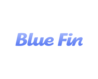
Is that custom type? nice fin in the n %3B-)
Replynice little wave action going too. Clever subliminal work.
ReplyThanks for the float. Yes, the counter in the letter %22n%22 is made to look like a fin. I was a bit concerned that it would be too subtle for people who aren't used to looking at negative space, though.
ReplyVery clever. The 'n' makes it. Perhaps a little less space between the two words. Just being nit-picky. %3B-)
ReplyI have the urge to connect your letters together. This is so close to a script font.
ReplyDamn, you beat me to it! I've just done the same thing with the k of the word 'shark'. Nice work anyway.
Reply@firebrand: Hey, we can all share in the fun. We're just gonna need a bigger boat.
ReplyMr. Hooper...!
Reply@pineapple: Ah yes, Robert Shaw's classic line in Jaws %3B)
ReplyI had done one before too but with a stiletto shoe.
ReplyI second what sdijock said about the letters connecting together. Might even give the logo more flow.
ReplyUpdated, with connected letters. The %22in%22 form was a little difficult to make without it ending up looking like %22un.%22 I think I got it to work, though.
ReplyPlease login/signup to make a comment, registration is easy