GS (Gregory Sanchez)
by cream5 • Uploaded: Aug. 01 '12 - Gallerized: Aug. '12
")


Float
(Floaters:
25 )
Description:
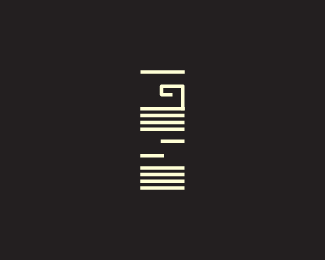
Client is an electronic music buff and producer. For his logo he wanted a concept that was contemporary and sort of abstract and something to do with music of course. I've tried to put all that together and made this piece. Everything's in negative space.
A 3rd and 4th variation has been updated couple times now. Feedback appreciated! thanks
Status:
Client work
Viewed:
13410
Tags:
•
artwork
•
vector
•
defined
Share:


Lets Discuss
It took a little while for me to be able to read this but, it does make a really interesting shape!!!
ReplyMaybe a few lines on top will help with the reading?
ReplyThanks Hayes & Husac.
Reply@Husac: I thought about adding but it increases the vertical proportion by a lot if i add more. But it's on my mind though, thanks!
I'd take a bar from the bottom and add it to the top so you arent extending but helping with the legibility, however having said that, this is very interesting.
Replythank you Climax! I'm going to work on the advice you Climax and Husac mentioned. You guys are prolly right on it. I was just sketching with the extra bars on top and it does give it an extra legibility.
Reply^ClimaxDesigns - that was what I was thinking of, taking one bar from the bottom :)
ReplyI floated this, because I like where it's headed, but I don't know if it's there yet.
ReplyAs a former electronic music DJ of about 10 years (mostly house & breaks; dabbled in DnB & dubstep), I feel like there is definitely some allure to this from a techie standpoint, and it *does* have a slight nod to a sort of abstract representation of music.
But most EDM follows a 4/4 time signature, and E V E R Y T H I N G revolves around multiples of 4. 4 beats per measure, (generally) 4 measures per phrase, etc. Significant musical events and audio cues (crash cymbals, the addition of layered sounds, buildups, breakdowns, etc.) all happen on a 4-count. So learning to DJ begins as a counting game, and the 4-counts are repeated over and over and OVER again until it becomes second nature.
I say all this because, given my background, I look at this trying to derive a musical pattern based on 4's and that's where I feel it falls flat, pardon the pun.
Starting at the bottom, I see 4 beats. But then, the two half-lines that form the negative-space G disrupt the flow. Moving upward, I see 4 more beats, but on the 4th beat, I see it as a type of musical wobble, like someone hitting a distortion effect. Not so bad on its own, but in context of this "visual musical composition" I feel like I'm looking at, it doesn't seem to flow. Then, the composition ends, mysteriously, with 1 beat.
I think this concept would work much better if you grabbed an EDM track (preferably House, which is relatively formulaic in its composition), listened to it over and over again, and tried to:
FIRST - visually sketch out what you're hearing, i.e., make different sized tick marks to represent bass kicks, snare hits, hi-hat hits, and cymbal crashes.
SECOND - look at this visual composition and see where, if anywhere, you might be able to 'hide' a G and an S. Maybe you can't. If not, perhaps you can use your visual composition as a mark, and develop some interesting typography to go beneath it.
Anyway, just some ideas. Feel free to ignore. I am really interested to see what you do with this, though.
Good comments above. What I first noticed is the vertical lines in the G area, but none in the S. I would see if you can pull this off without the vertical lines. I get the feel of a VU meter, and that curly flair on the G seems to out of character. Hope that helps.
Reply@atomicvibe wish we had more indepth commentary like that on this site, all sound ideas.
ReplyAtomicvibe,thanks for the insight, I was indeed going for the 4/4 time. I'm kinda nervous now that you guys said there's quite a few possibilites here.Working on it. thanks again for the awesome feedback.
ReplyThanks, David. I try. Unfortunately, with my schedule, I don't have the chance to get on here and comment like that nearly as often as I'd like.
ReplyAbi, what's your deadline? If you have some wiggle room, I'd really advise putting some more thought into this to see how you can push it further/make it stronger.
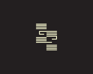
ReplyAtomicvibe, I've got till next tuesday. I would really love to take this more than what it is, putting in all the suggestions you made and everybody else. I've got a version now im working on without just one bar on top and the rest are sort of connected. I'll upload that version.
ReplyReally neat mark, the one bar at the top is makes the G pop out much more, then you're left looking for other letters, then there's the S.
ReplyAt first glance it looks like the neck of a guitar.
ReplyI've updated another version based on the comments I got from Climax, atomic, Lumine, please let me know how the new version works.
Replyversion 4, the one with gs next to each other with no breaks n the lines but with the hooks looks nice
ReplyThanks David, I was thinking the same with the 4 th version. :D
ReplyScorpy, are you kidding? It seems like you do nothing other than post links to your work and claim it's similar to something else. It's getting kinda old now.
Replyit is getting old scorpy...
Replyi dont see SG.
ReplyBAD LOGO.
Olalb, sorry to hear that but if it helps it's GS and not SG and the letters are in negative space. I;ve done a few variations so that might help too. !cheers
Replythank you Thierry! I've kept 3 and 4 and i'm still playing with it. Doing a small case study on the 4/4 time signature so it comes out right as Jon (atomic) mentioned.
ReplyThat's awesome, Abi. Can't wait to see what you come up with.
ReplyJon, what do you think of the other versions i did? Do those work well? David thinks 4 does and lefty with 3. Your take on this?
ReplyYou are making some good improvements! For me, even more than the 4/4 idea is the timeline idea. Like a project in pro tools or similar tracking software. like this http://yakyakyak.fr/wp-content/uploads/2012/03/X2Pro-Pro-Tools-Timeline.png
ReplyKeep working on it, you are getting very close.
I agree with Climax, keeping atomicvibe's experienced comment in mind,the GS beside each other with the hooks and larger spacing is by far the winner!
Replythanks lumavine and durand. I think i sort of wrapped up on the case study and I am working towards a logo intro of some sort right now. thanks again jon, david,thierry, luma, durand, everyone else!
Replyhey guys, I just want ot thank everyone and for featuring this logo. The client is pretty happy with the 4th version and I showed them the feedback i got from here .thanks again and cheers!
ReplyLooks like we have a winner. Good deal. Now, the big question is: How will you integrate type?
Replydesign by committee worked! O.o WORD lmao!
Replylol. thanks committee! Jon, not sure of the type yet, i'm working on it. Going to have to keep it slab serif i suppose.
ReplyConfirmed on the type! just finished the sketch and sent it to the client, they seem happy about it. I'll update shortly and would like to know if the type is any original at all before i confirm on the final piece.
ReplyPlease login/signup to make a comment, registration is easy