Northern Mail
by cream5 • Uploaded: Jul. 29 '12 - Gallerized: Jul. '12

Float
(Floaters:
61 )
Description:
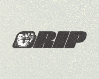
This is for a parcel delivery company for North America. Client wants to replace their existing logo and wanted a more royal vintage logo. I dont think I have to explain but the N is incorporated into the logo in 2 different ways :)
Status:
Work in progress
Viewed:
14280
Tags:
•
standard
•
typography
•
font
Share:


Lets Discuss
lovely work ... I like this style !!
Replythank you TAS! One of your pieces with the cork screw was the inspiration for this one.!
Replyexcellent
Replyreally like the hatching here. adds depth.
Replythanks yoon, colin. Colin: yeah i love hatching, used to do a lot of pen/ink work before and i decided i'll do it ditial this time. :D
Replyditial = digital, is what i meant :D
Replyi want send it..
Replyvery interesting...:)
Replythat makes me really happy ... and you've even made ȀBȀBit into the Gallery ... congrats buddy !!
Replythanks TAS! oneof your pieces was the inspiration! :D
ReplyBeautiful work!
ReplyI love the hidden N and shading.
Congrats!
Love the etching style.
Replythanks balic and rahul!
ReplyMeant to comment on this before; this logo is really dope, Abi. I really love the handmade, etched feel, and aesthetically, it really seems to align well with what the client was looking for. The N is very logically executed, which IMO is essential for these types of clever, hidden-image logos.
ReplyVery well done!
thanks a lot Jon, that means something if you think it is pretty good :D your ctritiques are pretty well thought out and helps a bunch. btw i read "dope" and for a second i thought you mean the logo was crap until i read the rest ofthe sentence and i was at peace lol :D
ReplyAhhh, right. I need to watch my use of slang sometimes, especially when I'm not sure if the person I'm speaking to is from the United States. I just naturally assumed you were, because I read the "ny" in your username as "New York."
ReplyOh i understand the phrase you mentioned. it's just that I took it out of context for a second when I just read " dope". And yeah I'm in NY, albany precisely. :D
Replythis is great, love the style
Replytiiiight
Replythank you occipital and valbo
ReplyGreat style!
ReplyThis is wonderful. I love the feel of it.
ReplyPlease login/signup to make a comment, registration is easy