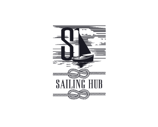
Sailing Hub
by cream5 • Uploaded: Aug. 07 '12

Float
(Floaters:
7 )
Description:
This is for a sailing club for a local town. They use mostly wooden traditional sailing boats and wanted a vintage sort of logo. There's traces of some negative space incorporated into the identity as well. Cheers
Status:
Work in progress
Viewed:
6869
Tags:
•
ocean
•
•
navy
Share:


Lets Discuss
very, very nice illustration - clever concept !!
Replythanks TAS! had to brainstorm a bit to get to this one:D
ReplyMan that S and the negative H with the boat is so strong I would love to see it without the sky and the nots, and with just a hint of water above the type. Your a Negative Space Ninja!
Reply@ogtbarnes Thanks, yeah I might have gone overboard with this lol. Simplifying it like you suggested would clean it up a bit.
ReplyPlease login/signup to make a comment, registration is easy