Arrow Inc
by cream5 • Uploaded: Jul. 19 '12 - Gallerized: Nov. '12

Float
(Floaters:
51 )
Description:
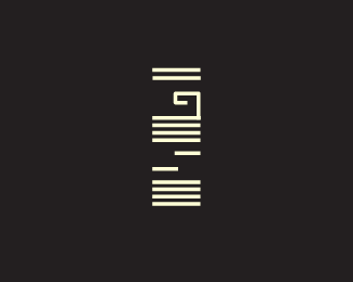
Arrow Inc is a communications startup and the client requested for a negative design concept because there were too many plain logomark arrow logos as it is.So he requested for a more intelligent design.There is an A in negative space and an arrow pointing towards the company name.
edit: Unused.
Status:
Unused proposal
Viewed:
29431
Tags:
vivid
•
clarity
•
security
•
systems
Share:
Lets Discuss
Very nice combination of type and symbol. Love it.
Replythank you! tried all sorts of combinations and then ended with this:D
Replyclever
Replythank you... brainstormed a bit to get there.
Replyvery good concept
Replythank you. appreciate the comments :D
ReplyAwesome use of negative space :)
Replythank you williamfocus:D
ReplyLike it - pretty unique vision.
Replythanks purple
Replyas someone already said, clever!!
ReplyWell Abi, I'd say you nailed this one. This is really clever and simple, and seems to fit the brief completely.
ReplyOne thing though: If the official name of the biz is "Arrow Inc.," don't you have to include the "Inc." part in the logo?
thanks jon, scismatica.
ReplyJon: To my knowledge in the logo per se you dont need to add the Inc, or LLC or whatever else suffix they got. As their registered trademarked name it's ARROW, Inc. Some clients keep the inc in the mark and some don't from what i've seen but legally there's no issues here. Another thing is the client didn't want the Inc part in it either.
Forgot to edit, this turned out to be unused :/
ReplySimple and sensational
Replythanks designabot
Replyvery clever.
ReplyWhat a shame they didn't go for this. A timeless beauty.
ReplyIt's definitely a clever solution. I can't help see a traffic cone
Replythanks logoboom. yeah didn't get used.
Replythanks lefty, itsgareth!
missed this ... very nice piece !!
Replydid they go with another idea of yours? if so would like to see it. if not, they totally missed out in a big way. or was the startup a no go?
ReplyThanks Bernd and THEartist.
ReplyTHEArtist : Nope, I think they're holding off as of now.
smart
Replywoah just noticed! thanks guys!
ReplyIn a world filled with negative space Fedex logo\'s, you have provided me with yet another \"aha!\" moment when it comes to arrows. Kudos! V
ReplyYou nailed it, very nice!
Replyclever
Replythanks virguard, flattering. thanks chinook and john!
Replywow
Replyreally nice
ReplyNice, clean design. I didn\'t notice the \"A\" in the negative space right off the bat. It\'s nice that it\'s subtle, but it\'s there. What stood out to me was more of the \"traffic cone\" although it\'s obviously an arrow. Maybe a traffic company called arrow could use this too :) Overall, I love it!
Replythanks sabb, midgar, Anderrrson! Anderrrson: OOh didnt see the cone till you mentioned, interesting! Yeah, this one is just sitting in the back burner for now.
ReplyPerfect idea. Brilliant. What surprises me most is how unforced the perspective(s) feel — fantastic!
ReplyVery smart, very clever. Love it!
ReplyAWESOME! Very clever solution!
ReplyExcellent.
ReplyPlease login/signup to make a comment, registration is easy