Baird
by richardbaird • Uploaded: Mar. 07 '12

Float
(Floaters:
14 )
Description:
Since my last rebrand (over 4 years ago I think) I've completely changed my processes, the style of work I do and now spend a lot of time writing and reviewing design. As such I don't feel my current identity is truly representative of where I am now so have worked up an idea I've had on my mind for a while. I haven't completely settled on this yet and still considering the wider applications and implications of adopting a new visual identity. Opinions are very welcome but please do check my website and see how this functions alongside the work I produce.
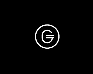
The two parts of a complete circle represent a dual brand and packaging service and the complimentary approach I take while the slight tilt adds a more unconventional quality. The utilitarian stencil aesthetic characterises a practical, systematic approach and the often minimal solutions (this is also emphasised by the simple geometry of the letter-forms). The flourishes across the 'a' and 'r' (of a bespoke logo-type) are designed to offset this slightly and give a slightly broader impression of my abilities as well as drawing in creativity and the written aspect of my work. A mono-line weight delivers a consistent sense of reliability but also one of appropriate restraint. The line weights will change depending on the size of the application.
Of course the majority of people won't read these things from an identity but feel it's important for me to make sure that it's relevant and representative.
As seen on:
Richard Baird
Status:
Client work
Viewed:
3466
Tags:
typography
•
logo-type
•
personal
Share:


Lets Discuss
The type is nice, and well balanced inside circle imo.*It looks better to me as black on white background, somehow this looks too dark to me, there is more darkness than light (... don't know if this makes sense to you? :) )*I know you probably don't want to hear this, but I like the old logo much better. The type, simple black shape, unusual but very interesting purple shape which makes it special, nice color... I really like that one.*Good luck!
ReplyI'm very happy to read any criticism and appreciate the time you have taken to write out a comment. The presentation here follows the way I like to showcase my identity work, the execution elsewhere is on a white background as you suggested. Thanks for adding your thoughts.
Replyvery solid work, buddy :)
ReplyPlease login/signup to make a comment, registration is easy