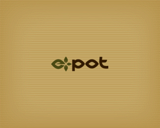
e-pot
by Mikeymike • Uploaded: Jan. 20 '11

Float
(Floaters:
12 )
Description:
WIP. _ V3 concept for a company that makes eco-friendly biodegradable pots for growing plants. other concepts can be seen at http://logopond.com/gallery/detail/126240 or http://logopond.com/gallery/detail/126316
Status:
Work in progress
Viewed:
1749
Share:


Lets Discuss
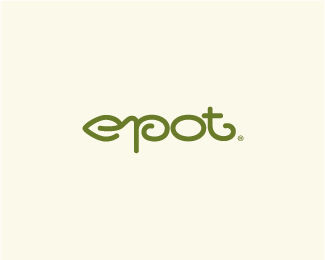
another direction, with an icon. 2 busy?
ReplyMark is great Mikey, I would go for a less distractive type (it might be too much) here and it will be a winner. Type alone also work.
ReplyThanks, Milou. That's what I thought, the type may be too much. thanks for the insight.
ReplyUPDATE: changed out the type. little less attention from the type now, I think.*Thanks, Milou.
ReplyMikey, what do their pots look like? Might try a different perspective?
Replygood suggestion, Mike.*my understanding is they are planning on different shapes and sizes. But the different perspective approach is something to look at. Thanks, man.
ReplyLovely mark!
ReplyI love the femininity of this mark. It has a grace that other versions do not possess.
ReplyThanks, Daria. And you too as well, JF.
ReplyPlease login/signup to make a comment, registration is easy