e-pot
by Mikeymike • Uploaded: Jan. 21 '11 - Gallerized: Jan. '11

Float
(Floaters:
38 )
Description:
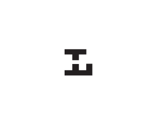
WIP. _ V4 concept for a company that makes eco-friendly biodegradable pots for growing plants. other concepts can be seen at http://logopond.com/gallery/detail/126240 or http://logopond.com/gallery/detail/126316 or http://logopond.com/gallery/detail/126322
Status:
Work in progress
Viewed:
4564
Share:


Lets Discuss
one more concept to throw out there. still legible enough?
ReplyInteresting type, love those curls.
ReplyThanks, Milou. would you have read it okay if I had not posted what it stood for? curious.
ReplyI think 'e' is visible enough, so that shouldn't be a problem.
ReplyNice, nice, nice work.
ReplyThanks, mate. :)
ReplyLindo, Mike! :)
ReplyThis concept feels the least hi-tech, which may or may not be what you want in this case. I like it a lot!
ReplyI see the growing)
ReplyThanks for the kind words, bitencourt, luma and ladygrey. And thanks to whomever placed this one in the gallery. Much appreciated.
ReplyLove the type, something pricks me about the curve out of e. I guess it's just me. :) Nice work.
Replywell deserved spot, lovely natural flow on it Mikey.
Replythanks, Paul. Client isn't quite on board, but I'm working on it. :)
Replynice... love the joining effect..
ReplyPlease login/signup to make a comment, registration is easy