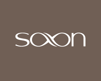
Description:
A wedding and custom portrait photographer. Symbolizes eternity/infinity.
As seen on:
http://shaunsaxonblog.com
Status:
Client work
Viewed:
25432
Share:



Lets Discuss
sweet Roy. Suprising it reads Saxon so easily.
Replythis is very nice!.. %26 the great thing about it is that if you turn it upside down it reads UAXOS... **...**lol
ReplyWow, it has class, originality, distinctiveness and reads well. Beautiful piece.
ReplyWOW...very nice. great job.
Replydeserves a gallery place imo - lovely work!
ReplyReally, very nice work. Love it.
Replynice one Roy.%0D*
ReplyExactly what Art said. Couldn't have summed it up better myself.
ReplyVery readable. Lovely.
ReplyThanks for the comments, guys.
ReplyI love it. Only downside is that it fails the 'squint' test. Then it looks like it says 'soon'.
ReplyGood work, Roy!
ReplyI find this beautiful and meaningful but I don't find it exactly easy to read.
ReplySquint test? How does this change when you squint? I see no failure with this one.
ReplyAWESOME.
Replyalso fails the sound test too... ***sigh
Replylol!!!*Great....
ReplyI find it really clever, too, but I read SOON at a first glance. I only read saxon when I saw the description.*beautiful anyway.
ReplyBeautiful! This goes straight into my favs...
ReplyWow. Love it
Replyvery elegant, luv it!
ReplyI'm sorry, not smelling anything...hang on....nup...definitely not smelling anything too 'SOON'.%0D*%0D*Yes, its failed every sensory test folks %3B-)%0D*%0D*btw, great type logo Roy.
ReplyHaha, these comments are almost as funny as the WillCOCK ones. Thanks for the feedback.
ReplyThis rocks. I read it as Saxon at first, then was unsure, then was pretty sure it was Saxon. I think it totally comes across. Sweet work.
ReplyI like the idea/simbolism behind that %26 the execution as well! I just read saxon, so the readabillity is good to me.
ReplyI like it, although I didn't read %22saxon%22 right away.**I don't know if this is %22my problem%22 but I'm not a native english speaker, maybe saxon is a word I don't know?
ReplyA 'squint test' is a quick way of determining legibility from distance. It's nothing to do with people with bad eyesight. **If it's on a shop front and people read it as 'soon', then surely it has failed as a logo. That's why consumer groups get to test logos out.
ReplyLOL!.. thats gotta be the funniest thing i ever heard!.. a squint test!.. hows about a 'run by test' where someone runs by the logo really fast!... you know.. to see what it may look like while driving past said shop front.. or on a bike... hows about the 'run by while squinting test'... for those driving at a distance!
Reply@ nido, you're a tonic round here. You should be in stand up mate. lol!
ReplyThat's the funniest thing you've ever heard? You should get out more. It's just a test. And yeah, I do think a sign needs to be legible when people drive and run past. **So you think a logo that people can't read and see the brand name is good, do you? I have never heard of a client who doesn't want their brand name to be legible before.**I guess I'm not a style over substance person.**It's funny how quick people are to knock something. I was just offering an opinion. I like the logo.**And Firebrand, what a child you are. It was very funny of you to look at one of my logos and mention the squint test. I apologise for not sticking my tongue up your bum like everyone else, but throwing your rattle out of the pram because I didn't join in is pathetic.*
ReplyWhether it fails the 'squint test' or not, it's still memorable. Every time I see this in the gallery, I automatically think 'Saxon'.**P.S. My Grandmother saw this on Thanksgiving and knew what it said right away...and her vision ain't too great. So, I'd say this passes the 'squint test'.
Reply@ Ocular: That's good enough for me. Thanks, mate.
ReplyAnd me.
Replyget her to do the running thing mate!.. get her to do it!!!
ReplyAh, peace and harmony.
Reply@ nido : LOL!! I'll post it on YouTube.
ReplyVery Nice, Elegant and Elaborate.
Replytotally readable and pure. Perfect.
Replygreat
ReplyThanks bonoos and everyone for the feedback. HNY.
Replyamazing!
ReplyThanks Denis :)
ReplyBriiliant. Reads very easy
Replyi read %22sabn%22 at first, saxon later.
ReplyThis logo shows a deft handling of stroke weight, shape and form. Excellent work.
Replyreally nice logotype.
ReplyThanks, pixelcraft, grubedoo, wilsonink and mo :)
ReplyThis is so great, probably the best treatment of lettering I've seen.*
ReplyThanks Kokolynee! :)
ReplyI'm pleased to say that Catherine Fishel of Logo Lounge recently interviewed me and has written an article about the development this logo. All being well, it should feature in book 5.
ReplyCongrats Big Fella!
ReplyThat's great to hear. Well done Roy :)
Replyfantabulous Roy.
ReplyFab, Sean, Mike. Thanks for the support, guys! :)
Replygreat use of typography. This one definatelly shines upon others, true gem in logotypes
ReplyThanks kozlov :)
Replylost for words, great
ReplyI've been MIA from LogoPond for a while, hence the late compliment.**I like it a lot.
ReplyThanks, David. I've sent you an email.
ReplyHey Roy I actually favourited this ages ago and only today have floated it that must mean that I was so excited when I saw it first saw it...inspirational stuff.
ReplyCheers, bud. :D
ReplyLATEFLOAT! This could work like a brand... Hmmm... Nice job, Roy!
Reply%3DD
Reply*iLuv!*excellent work.
ReplyCheers, yummie!
ReplyTight!
ReplyGooooooood wok,*Very accurate.**I like it!
Replyjerron and 2creativo... thanks!
Reply@farmill: Seriously? Same word. Same ambigram out of axo. Same colours.**This has got to stop, David.**http://brandstack.com/logos/details/9497
ReplyI agree... Brandstack should be banned from LP...
ReplyHoly crap!! That's it. I'm done with Brandstack. Removing my logos now.
ReplyI agree, At one time I actually thought it was a good idea with unused designs, but now they are taking anything and everything with no respect to the industry or other designers work at all. I am no longer a member of BS.
ReplyCompletely agree with you, Mike. I've removed all of my logos from BS.
ReplyThanks for your support guys. It's gone too far now what with this and Gareth's Thoppai logo flagged up just today.
Reply@Ocularink and @logomotive I don't blame you at all. I've noticed that you've been uncomfortable with it for some time. It has it's place but not here.
ReplyI agree with you all. And what these Blandcacker's need to realise is that they are not just ripping the work of designers but also stealing the identity's of our clients businesses. Nido hit the nail on the head for the first time ever, but what can you do eh? It's either that or not post work on LP anymore...
Replylet's see who's interested first... %22here ya go%22:http://logopond.com/forum/viewtopic.php?id%3D3576**
ReplyRoy, have you contacted BS yet?
ReplyYes I have, Mike.
ReplyTabitha, I strongly disagree http://brandstack.com/logos/details/9497
ReplyI'm with Kev, Roy, Nido and Mike on this, i'm going to remove my logos from Brandstack. There has been so many logos in the 'View All' page that have made me bash my head off my keyboard. Hope logopond doesn't lose the respect it deserves due to the creation of logos which consist of combining two random words together.
ReplyGlad to see so many people taking a stand. Guess we're all fed up!!
ReplyEnough is enough!
ReplyThank you, Alessandro.
ReplyFantastic work.
ReplyI'd like to see this in Club 100 Roy. What can we do to make that happen? :)
ReplyHelped :) 96
ReplyCheers all. Thanks for the gentle nudge, Joe.
Replyvery nice, I really like this one! *-N8
ReplyAm I allowed to float this again?
Reply%5E Nope.
ReplyI read this as saxon, just like it suppose too. Great job.
ReplyPlease login/signup to make a comment, registration is easy