Description:
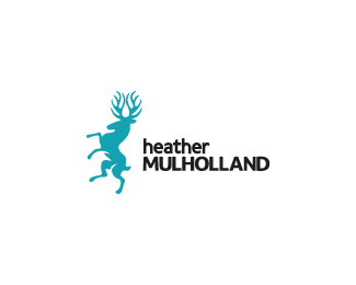
logo design for a photographer and web developer. Wanting something bold, strong, unique, featuring a stag and doesn't specifically fall into either the photographer or web design category.
Hand drawn lowercase type. Caps are slightly edited font.
As seen on:
Heather Mulholland (mine for now)
Status:
Client work
Viewed:
10334
Share:




Lets Discuss
mark looks nice.
ReplyI like your moose!
ReplyCheers fellas :) its a stag but thanks anyway :D
ReplyMoose, stag, eh same big family :)) I really hope your stag was not offended by my words :p **PS. Congrats for gallery selection!
Replyhaha, aye same thing really. I'm sure its fine, man, i wouldn't worry :P Thanks again, bud.
Replythis is cool.. but im not feeling the upper and lowercase together.. but that may be subjective
ReplyCheers Danny, ill upload a couple of the other versions with different fonts.
ReplyNice one! Very unique! I wonder if you've tried flipping the stag so that it's facing to the right, so as to direct the eye to the name? Also agreeing with Danny about the upper and lower case, might try small caps for %22heather%22 to have that contrast, if that was your goal. All that aside, this really is an exceptional mark :)
ReplyThanks Jenny :) It started off facing the right but Heather and I decided to flip it the other way. Font alternatives can be seen on my website http://www.euanmackenzie.com/logo-design-portfolio/heather-mulholland-logo-design-vancouver/**cheers!
Replylooks good. like the mark alot and the color of it as well.
ReplyO.o It has a boner...
Replyomnidesign: I'd say that's more of an arm shadow, and at least 95%25 of the audience will see it as such
ReplyLoving it!
Replythe boner doesn't really worry me, man, thanks for pointing it out though. Appreciate it.... haha!**cheers fellas :)
ReplyWell, if it's mistaken for that....at least he looks 'happy'... :)
Replyhaha exactly man, leave him be, hes enjoying himself :)
ReplyStraight class. Very nice.
ReplyThanks Chad. See the logo in use here http://www.heathermulholland.com/blog/
ReplyLook really nice ezie!!
ReplyClassy little guy.
Replythis one just clean and valuable, like it!
ReplyPlease login/signup to make a comment, registration is easy