Description:
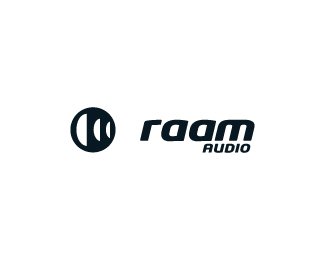
Logo design for a car and home audio company.
They wanted a strong and bold icon.
p.s (had previously uploaded this logo earlier but i thought it was far more effective on a white bg) :)
As seen on:
euanmackenzie.com
Status:
Client work
Viewed:
3814
Share:




Lets Discuss
1, nice, very nice logo....*please for your opinion on my logo in the link:*http://logopond.com/gallery/detail/68531
ReplyI'd love to see the logomark on the left 'flipped' horizontally to convey motion going from left to right%3B currently, it looks like the 'roam' and graphic are going different directions, and aren't unified. Like the sound waves (I think that's what they are, right?) regardless. Have a good day! I'll check back to see what your mindset was for those.
ReplyThanks AD. I tried it with the mark flipped the other way however it just didn't feel as good as the way it is, you know? Its the 6th sense of logo designing! But you have a very valid point.**Thanks Nima :)
Replylove that type!
ReplyThis is sweet man
Replycheers, man, im glad you like it :)
ReplyI feel like there's a bit too much space between the icon and type. Other than that I can dig it.
ReplyI actually like the space. This is really nice stuff!
Replycheers lads
ReplyPlease login/signup to make a comment, registration is easy