Description:
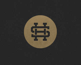
HS monogram for my name. Thinking of using this on my new website that is coming very soon. I have a pixelated version too, for really small sizes.
As seen on:
http://www.bilebo.com
Status:
Nothing set
Viewed:
20155
Share:

Lets Discuss
Thanks, man! You sure know how to make one's Thursday night :)*Still wanna switch with you though %3B)
Replyit gets my love - enjoy your Thursday! - It's Friday here now - good night
ReplyThanks! Great to hear! Friday here too now :) Good night to you!
Replywow :)
Replygod I love that
ReplyPerfect monogram you got yourself here. Impressive!
ReplyGreat work Henric!
Replyreally like this, find a nice type and you have a winner :)
Replyvery cool. nice colors/feeling too.
ReplyVery strong mark! :)
ReplyReally nice. Fav'd and floated.
Replytrue story, very nice.
ReplyThis is great, nice work.
ReplyThanks everybody! Really nice to hear, you guys!**I might add type to this, but I don't think that a symbol always needs type, just like type don't always needs a symbol. We'll see :)
Replyi wouldn't add type to it..
ReplyTechnically there is type in it already :)
ReplyI like your swag dude.
ReplyMissed this, man. Very cool. I hope you plan on incorporating the texture on your new site.
Replylooks like money :)
ReplyThanks a lot guys!*Mange tak :)**Hmm.. Trying not to go overboard with the texture on the site to keep the work itself in the spotlight :)**I hope so, Mike %3B)
ReplyWelcome back! :)*Hopefully to be viewed on my new website really soon, but this weekend I am too busy to launch..
ReplyLooks fantastic!!
ReplyThanks a lot, Alan!
Replyi love it, simple, classy, noticable, very nice :)
ReplyThanks illumnia and ecto! :)
Replywhen ya gonna add some type to this beauty?
Reply%5EShame this won't make the gallery because there's %22no type%22 with it. That's the one thing that's always peeved me. Does a good piece of art need type with it? Debatable. But I still think it's unfair this won't receive homepage recognition just because there's nothing written besides the logo - maybe I'm the only one that things this. Real hot piece man.
ReplyI love this logomark. Personally speaking, I developed a slammin' new personal logomark a few months ago, but am waiting to get it trademarked. I perhaps am too paranoid about something so lovely getting ripped off. I would hate to see anyone rip this one off too. Just thinking aloud.
Replyyep Joe, why I made my comment :)
Reply%5E Speaking of it JF, similar concept showed up at Dribbble recently..
Reply%5Eyep I saw that too. With all due respect David, I've seen a few other logos in gallery from past that did not have type. http://logopond.com/gallery/detail/48 one for instance.
Reply%5E%5ESaw that one too guys. And Mike, I think that one you linked was really early in the stages of LP when David wasn't sure of whether designs without type should be added or not. Now that it's certainly a rule, you don't see it happen that much (if all for that matter). Maybe I'm forgetting of some that have been added in...sure a few have slid by :) Either way I know this is something that has been addressed in the forum at least once or twice - both sides made convincing cases.
ReplyI can see David's point, however I feel logos like this should be allowed. I think it's because he does not want just a bunch of art icons in the gallery.
ReplyGreat logo
ReplyI had made a forum thread on this in the past at http://pondpad.com/forum/viewtopic.php?id%3D4293*A work in progress tag was probably all that will have come out of it and its subsequent requests. %3B%5E)**For those curious this is another exception to the no type rule*http://logopond.com/gallery/detail/86518
Replyand this one http://logopond.com/gallery/detail/111772 .I think that all deserve to be there.
Replymilou, a similar concept to this SH monogram? Could you post a link?
Reply@JF: This one, I think: http://dribbble.com/shots/109064-Hannah-Suh-Soon-but-not-yet-
ReplyI don't think its that big of a deal. It almost feels like if this logo isn't featured it loses it's purpose here. If Henric is happy with his (outstanding) personal mark, then it's all good, I guess.**Not judging anything here, but are you guys sure that if this gets some type, then it instantly goes in the gallery? Asking just because I've seen logos with far more floats, and type also, that did not get spotted.**There was another thread with lots of comments about the no-type logos, on a mark with a V Fish? Anybody knows what I'm talking about? Interesting thoughts there too.
ReplyCongrats!
ReplySomeone wanted to see this one on a front page? :) Congrats, Henric!
Replycongratulations:)
ReplyThanks guys! Really appreciate it!*And quite the discussion going on here :)
ReplyCongrats! you got an amazing typography skill.
ReplyCongrats man, great work.
Replycongratz for the feature! :D
ReplyGrats buddy.
Replylovely work. Congratulations.**
ReplyThanks a lot everybody! Means a lot :)
ReplyCongrats Henric. This logo monogram is pure beauty :)
Replyle9itam8. reminds me of the old school baseball logos that are still in use today. like the San Francisco giants one. clean and simple with a little bit of clever, never gets old. keep it fresh bro, love your stuff.
ReplyCongrats on the feature, man. Noticed your new site up on CSS Mania too. Keep it up!
ReplyCongrats on the feature, wonderful work, didn't you have a ton more logos in your showcase?
Replycongrats Henric!
ReplyCongrats my man!!
ReplyCongrats!
ReplyCongratulations on the feature!
ReplyThanks a lot everybody! Really nice to hear! *I might have deleted a few logos yes :) *Can't post much new work at the time unfortunately... Kinda bad timing hehe..
ReplyAmazing, good work!
ReplyAny Notre Dame fan will love this!
ReplyPlease login/signup to make a comment, registration is easy