KASEY
by bilebo • Uploaded: Mar. 12 '10 - Gallerized: Mar. '10

Float
(Floaters:
51 )
Description:
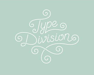
Kasey likes to snowboard..
Oh, this is an ambigram by the way..
Status:
Just for fun
Viewed:
15497
Share:


Lets Discuss
flowee...
ReplyI like the look to it. Nice!!
ReplyLike it a lot ... I think there is still potential in tagline font
ReplyThanks a lot y'all!**I changed and moved around the tag line a bit..*It seems impossible to align it right tho!
Replyambigrams are always cool - you did an amazing job here
Replytres cool
Replyterrific ambigram. every swish feels like you boarded through with you board. cool. :) glad it made gallery.
ReplyGreat job
ReplyGreat execution, but I was instantly reminded of the ase logo www.ase.dk.
ReplyI keep reading this Kasek for some reason... Shortening the vertical stem of the K (on the upper part) would shorten the one on the Y (on the lower part) and make Y more legible and entire ambigram would still be super readable...
ReplyKasek indeed, but nonetheless awesome!
ReplyVery clever ambigram, I think it's great
ReplyThank you everybody! Nice to see this on the front page!**Type08, I feel like shortening the top part of the stem on the K would make the K very hard to read. Also that part of the K makes out the bottom of the stem on the Y, so I don't see how that would help actually :)*Maybe it's not clear enough what part is supposed to be the stem of the Y..**vintage_chic, I actually like how the K and Y brings some stability to the logo, but I see what you're saying, I might give that a try!
Replyclever! congrats!
ReplyI didn't mean fully but only partially, like 2/3 of the size. The lower curve that connects Y with the E would seem like a stem of the Y...
ReplyThe middle section is similar to the 'ase' logo, but I like this much better, very clever :o)
ReplyIt sure does. And I'm 50%25 Danish! But I promise I've never seen the ASE logo before %3B)
ReplyOh, and thank you! :)
ReplyVery creative work there Bilebo. Love the font and the colours. Keep up the great work friend.:)
ReplyPlease login/signup to make a comment, registration is easy