"Secret Brotherhood"
by bilebo • Uploaded: Aug. 16 '10
Float
(Floaters:
32 )
Description:
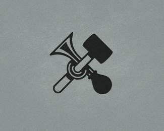
Logo for a super duper secret brotherhood/orden. Simple and classic style. Name undisclosed :)
As seen on:
http://www.bilebo.com
Status:
Nothing set
Viewed:
4781
Share:


Lets Discuss
I'm digging it too. The reflections on the horn are nice. The only thing that bugs me just a little bit are the reflections where it wraps around the hammer (I think that's a hammer). They sort of bulge on the ends. It might look better if they were the same thickness all the way through. Looking nice though.
ReplyThanks man, appreciate it!*But 100%25? I though I was like 50%25 there %3B)
ReplyGotcha Ocular! Bugging me too, just been too lazy to fix it yet :)**I might have an update soon!
Replynice work, bilebo. not so sure about the sizes of the objects and shadowing - maybe make those ends of the shadow for the hammer the same? make that hammer bigger or just the top part, also the shadow for the top part of the hammer is necessary? make more difference, contrast or sort of..hope that helps:)
ReplyI think part of the appeal of this logo is the intrigue. I love it.
ReplyUPDATE!*OcularInk – I touched up on the reflections. I had to pull out the calculator to get it right.*Myway999 – Not sure that I know what you mean by %22those ends%22?*I was looking at a rubber hammer like this one: http://bit.ly/aEKrdR**And thanks to y'all!***
ReplyLike you say Henric, Simple and classic!! Love it!
ReplyThanks a lot Alan! Aprecio! :)
ReplyPlease login/signup to make a comment, registration is easy