Description:
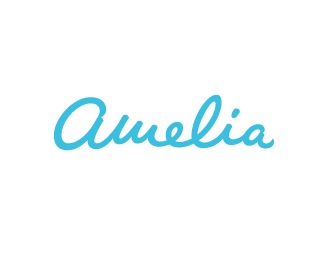
Typographical exercise. Sure this has been done before :)
As seen on:
http://www.bilebo.com
Status:
Just for fun
Viewed:
9768
Share:


Lets Discuss
nice work bilebo!
Replythanks, biggie! %3B)
ReplyNever seen it before and the execution is wonderful.
ReplyThis is nicely executed.
ReplyThanks guys! Heartwarming :)
ReplyThe %22Fashionista%22:http://fashionista.com/ logo seems close.
ReplyGREAT work.**Maybe that could be more legible, i'd read Bread. T-R could bem best than theyre. :)
ReplyBitencourt:*Thank you!*I read %22bem best than theyre%22 and I don't know what that means %3B)**Art:*Yeah, I've seen that one before! This was just for fun tho (not that I am accusing you of accusing me %3B)
Replynice!
Replygreat work man.
ReplyThanks, T%F6mme and Micky D! :)
ReplyBeautifully rendered!
ReplyThank you, Sandhya!
ReplyPlease login/signup to make a comment, registration is easy