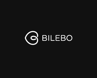
Description:
Third go on my personal logotype.
The type kept basic because I want to use the symbol alone as much as possible, so the type isn't crucial. I also feel it fits me well. Conveys my style.
As seen on:
http://www.bilebo.com
Status:
Unused proposal
Viewed:
6545
Share:

Lets Discuss
prefer this clean n neat type!
Replythis is it!
ReplyThanks guys!*I added a gap in the B's too, if you don't mind :)**Like I said I will probably use the symbol by itself more often.*/The Artist Formerly Known as Bilebo
Replythis is good!
ReplyThanks, Ferret and Houston! :)
Replyvery clean and strong. nice.
ReplyVery nice, like it a lot.
ReplyDefinitely better than the other one and the cut on the B's is a nice touch. Still I find the type a bit overpowering.
ReplyThanks y'all! :)**Art%3B I've played around different sizes, but the symbol is so simple that it looks kinda clunky when it's big (in relation to the type). I might try some more tho! Thanks for the constructive crit! :)
ReplyYeah! This is nice.
Replynice one:)
ReplyThanks, doods! %3C3 :)
ReplyWell done 'mate.
ReplyNice choice of type for this mark. It works a treat and taken a different tone from the red option previous. I just love it when a plan comes together.
Replyhttp://www.museuberardo.com/Splash/MCB_logo.png **reminded me of this one
ReplyAgain, love the new ID!
ReplyThanks errbody! I take it all in %3D)**logonot: seems like all simple logo designs have been done a couple of times %3D/ but I still feel mine stands a part enough from the MCB one.**spitz, I love you(rs)!*I would love a B covered in leaves! maybe next time %3B)*
Reply%5EHa! Cheers! %3B)
ReplySorry for these mini-updates, but I had to remove those gaps in the Bs... They stole too much attention. Also cleaned up the type and made it slightly smaller.*Hope you guys are OK with this :)
ReplyReally nice mark, i also see you have great handwritten typography skills through your showcase.
ReplyThanks a lot, Lecart! Really appreciate it! I really like your Sevda logo!**Climax: Wonderful! No need to produce my own jewelry then %3B)
Reply%5EIts a little similar to the heart the in the Habitat logo, but thats it, its a very nice self identity bilebo, well done mate.
ReplyMcD, yeah I realized that too, but I'm fine with that :)*Thanks mate!
ReplyThis is very nice. Like how it turned out.
Replyagree joe. really nice.
Replythanks a loot guys!
ReplyPlease login/signup to make a comment, registration is easy