Description:
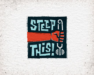
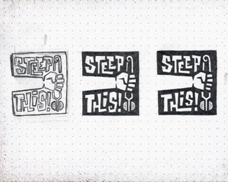
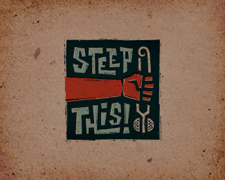
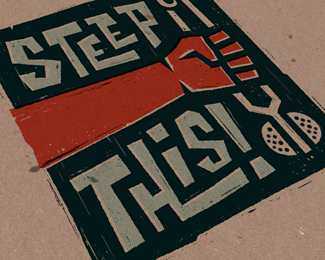
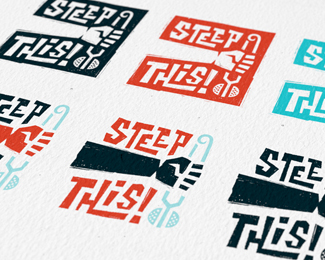
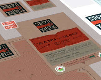
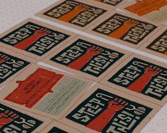
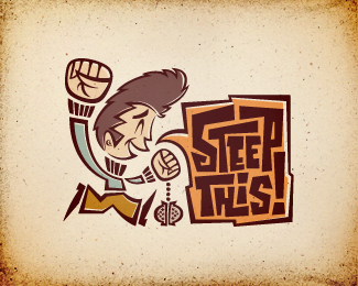
Logo proposal for start-up loose leaf tea company. The brand's values and messaging themes of freedom of choice & empowerment were heavily inspired by the U.S. civil rights movements of the '60s & '70s. Target audience: People who want to belong to a "tea scene" for like-minded individuals, but don't find themselves aligning with any of the current tea-drinking demographics, and are often dismayed by the negative stigmas surrounding tea. Tone: Should reflect the era, but avoid overly militaristic or psychedelic themes. Should portray boldness & strength, while still being fun, energetic, & youthful. Rationale: Inspired by an iconic hand gesture used to symbolize strength & solidarity throughout the civil rights era and beyond. Imagery of the fist clutching a tea infuser is bold, assertive, and inspires a call to action. Intentionally gritty and homemade, this concept reflects the grassroots nature of old protest signs and political literature which would have been screen printed and hand drawn in a basement field office. More info & images: http://bit.ly/dribbble-st01. Full case study: http://bit.ly/behance-st-case-study
As seen on:
Behance
Status:
Unused proposal
Viewed:
16319
Tags:
tea
•
infuser
•
fist
•
power fist
Share:


Lets Discuss
man you are a miracle ... everything you touch becomes gold ... love all your work !!
ReplyThanks, Bernd! I appreciate you taking a look :)
ReplyWonderful proposal! The branding potential is huge. Great job.
ReplyThis is absolutely epic Jon!!! The Saul Bass esque treatment is really appropriate here.
Reply...Currently running through your Behance case study & trying to 'maintain'. ;)
Wow, really great!
ReplyTabitha, Josh, Luma, I really appreciate the kind words, guys! Thank you so much for taking the time to check this mutha out.
ReplyThanks for the Gallery spot, David et al.!
really great... masterpiece!!!
ReplyWhile a cool treatment and logo can see this coping a lot of adverse publicity ... and being part of a few blog posts if picked ...
ReplyGreat development work, but yeah, this solution will do more harm than good.
ReplyHey, thanks for the comments guys.
ReplyFWIW, this direction was not picked (although it was a top contender), but Mike & Gareth, I appreciate the feedback, but could you explain what you mean?
The style of the tea infuser and the way the hand is placed looks a little sexual
ReplyWooooow. Yeah, didn't see that. And neither did several other designers with whom I shared all my initial sketches. Ugh. Just goes to show how easy it is for stuff like this to be overlooked.
ReplyOh well, not a big deal, since it wasn't chosen, anyway. But... damn...
Which one did they pick? It looks like you had a ton of great ideas in your sketches.
ReplyThey went with 04. Need to make some minor minor client-requested tweaks to that one, but will post here on LP after it's done.
Replyanother nice conceptual direction, JON!
ReplyYou're a champion of everything. Great work.
ReplyMikey, Sam, cheers gents! Really stoked you guys are digging this.
ReplyYeah this one would do great for linocut. Gotta update if you do get this linocut done. Would be pretty cool for a print job. I haven't done linocut in years.
Replyreally enjoy your masterpieces!! great work as usual!
ReplyThanks a lot, Gary! Glad you liked this one.
ReplyTea drinkers unite!
Reply^EXACTLY! You got it!
ReplyThink this one was my fave, but 04 is spectacular too!
ReplyI see the great grid system there.....love it pal :)
Replyi love your style and i understand the logo but yea........... looks a bit wrong to those who dont know what a tea infuser is or looks like. my immature mind made me chuckle a little but as mentioned i really love the style
ReplyCheers Fred, Hanuman, and Horacio! I appreciate you taking a look.
ReplyPlease login/signup to make a comment, registration is easy