Three Nuts General Contractors v.2
by atomicvibe • Uploaded: Jul. 28 '11 - Gallerized: Nov. '11

Float
(Floaters:
53 )
Description:
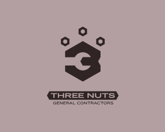
Logo for a team of general contractors.
Status:
Just for fun
Viewed:
35588
Share:


Lets Discuss
Interesting.. I think you could actually use just 3 nuts to create the 3. 2 Big and one small where the crescent wrench is, this will give the backside more of a notched 3 shape. I think the other 3 nuts would not be needed.
ReplyThis is well done, I think it works. The only element that I don't care for is the piece that extends out of the backside of the three from the wrench. I don't get what it is, and it certainly doesn't help the 3. I can't help seeing it as a larger whole piece that's fitting into the wrench. Maybe if the angled notch on the right side of this piece cut directly into the backside of the 3, and didn't extend out from it?
ReplyNot sure I get the object coming out of the wrench either. I would try making your large hexagon symmetrical, losing the object attached to the opening of the wrench and line up your text with the first descending corner of the hexagon and use that as an option. Just my two cents, take it or leave it.**All that being said, I love the direction this design is headed. Good work!
ReplyThanks for checking this one out, guys. I really appreciate the feedback.*@Mike, It's funny you say that, because the 3 is actually formed from 2 overlapping nuts (%3C--LOL). I'll see what I can do about your suggestion, but the problem I foresee is that, while the 3 is formed from the same hexagonal angularity found in a bolt nut, it is not, itself, a bolt nut (or two, per your suggestion). So I'm not sure the idea of %223 nuts%22 will visually come across without actually depicting 3 nuts somewhere in the design. Designers may get it, but I'm not sure the average person would. I'll try it, though, and see what happens.*@ Sam, that shape you mentioned is supposed to be 1) the crossbar of the 3, 2) a flag shape that is formed from the same hexagonal angularity found on a bolt nut, and 3) a visual cue (arrow) pointing to the wrench. Originally, my 3 looked exactly as you suggest (notch cut out of the back), but I actually extended the shape outward like this for the reasons I describe above. However, I guess it's not working. SO, I'll go back to the notch-back 3 version, and see if you guys think this aids the design.*@ Jordan, the %22large hexagon%22 really isn't supposed to be a hexagon per se, but rather a vertically-extended 3 formed from hexagonal angles. HOWEVER, you bring up an excellent point%3B perhaps I can try one in which the big shape actually *IS* a symmetrical hexagon - more of a bolt nut shape - with a notch cut out of the back to help define it as a 3.*I'll work on this a bit later, and post up some revisions :)
Reply*updated this logo based on suggestions of other LP members**The flag shape that originally formed the crossbar of the 3 has been removed (because others were confused by it and what it was supposed to be)%3B the main shape forming the 3 has been condensed vertically so that now, the shape is formed primarily from the shape of a hexagonal bolt nut, and reads better as a 3.*@LOGOMOTIVEMike, I tried your suggestion, but visually, it just didn't read as %223 nuts.%22 It really only read as a stylized 3 with a hidden wrench in negative space. So the visual connection to the name was lost. I think the average person would need a bit more of a bridge to make the connection, which is why I decided to keep the three nuts above the 3. I feel like it adds a sense of balance.*This version features a relatively simple type lockup, but here's another version which features the %22Three Nuts%22 text knocked out of a bar with hexagonal angles: http://logopond.com/gallery/detail/142838
ReplyWhat if the negative space shape directly to the right of the wrench was a nut that the wrench is approaching to turn. In other words, bring that V cut in a bit more with horizontal top and bottom lines. Nice work!
Reply%5EIf I think I'm understanding what you're suggesting, then the resulting shape wouldn't look like a 3. Also, If I brought that V-cut notch in closer to the wrench, the resulting positive shape wouldn't look like a nut%3B it would look like an arrow pointing at the center of the wrench. In order for it to look like a nut, the V-shaped notch would have to be flipped horizontally, and that just messes up the crossbar of the 3. See if this is what you were suggesting: http://atomicvibe.net/images/temp01.png
ReplyNo, that's not really what I meant. I was thinking of (2/3 of) a hexagon in white (yellow) forming the right side dent in the 3 where you just have a sideways V shape now. Like a sideways house shape cutting into the right side of the black. I could email you a sketch if that would make it more clear.
ReplySure. I must have tapioca inside this thick skull of mine, because I'm still not quite getting what you're suggesting. You can email me at: info %5Bat%5D atomicvibe %5Bdot%5D net.
ReplyAny other comments in the meantime?
ReplyAwesome work my friend. Dude, are you still alive these days?
ReplySeems slightly off centre to me, might be my eyes haha, i like the concept im not feeling the font though
ReplyWas just alerted that this little bugger was on the front page. Thanks, guys! Appreciate the comments and support!**Norman, yeah, still alive...I think. haven't been around in a while because I've been on a massive job search. It's been occupying most of my free time.
Replynice to see in the gallery. solid stuff, dude.
ReplyThanks for the feedback, Mikey!
ReplyGreat logo design.. Great combination of the 3 and the tool :)*Thumbs up
Replysmart
ReplyHow do you justify the crossbar of the T hanging outside left of the type lock up :D
Replynicely new interpretation of a traditional crest like sign ... striking positiv/negativ play ... simple but strong ...
ReplyThanks for the comments and floaties, guys!**Raja, here's my rationale for your T query:**I was always taught that in situations like this - when you're trying to align stacked type and other elements in a lockup, and you end up with top-heavy letters (T, W, Y) - always maintain a strong visual vertical line in your attempt to %22connect letters%22. This usually means that the bottoms of letters on one line align with the tops of letters on the second line, and so on - like I have here. The left side of the T crossbar may stick out over the edge, but because the letter T creates a very strong vertical, and I am trying to left align a stroke as well as another line of type to it, I think it looks cleaner this way.**If I had aligned the T the way you're suggesting, a big rectangular hole would be formed in that nook on the left side of the T, not to mention a dissonant vertical misalignment as the eye follows the letter T down its stem, hits the stroke, moves left a few clicks, and then moves down to read the second line of type. That's just clunky eye movement, if you ask me.**I may not be doing it right, but this is what I was taught, anyway. Anyone else wanna chime in here?
ReplyI understand your rational, it is what I figured. We have all been there. However, I think eye-movement is being a bit overrated in the case of this logo. **I am uneducated on the matter but my optical logic tells me that if so much thought is being put into this, and everything is contained, why would one odd corner not conform?**Personally I would try a few things fixes to the type block%3B**Explore font types, perhaps something condensed (or serfis?) with smaller T-tops as to reduce the aforementioned gape.**Center the two lines of type and remove the horizontal rule (what's it's purpose in this case?)**Add a vertical rule to the left of the horizontal one creating another T (ruler)**Reverse out the type on to a black rectangle background (makes it more solid/relevant...almost like a wooden 2 x 4)**As for the mark, the dent in the 3 (right side) seems unnecessary and implies a 4th nut which throws the 3 Nuts concept off...maybe a loose nut like me?**Anyway, just my humble opinion.**PS: Loved seeing the process / sketches.
ReplyPSS: I see you addressed the above in your process - I liked those!
ReplyIT's a copy of this italian custom bike producer: http://www.emporioelaborazioni.it/
Reply%5ESimilar, but no.**I've never even heard of that motorcycle manufacturer until now. This is just plain coincidence.
Replycopy is a bold statement. i see no problem here, just a similarity.
Replyoh man, I like.
Replyclever and it looks nothing like that motorcycle logo dopz was talking about. two entirely different concepts
ReplyThanks, Dawood & Abi!
ReplyGreat work! Apparently GraphicsAlley thought so too, as they're using it in their portfolio...
Replywww.kijiji.ca/v-graphic-web-design-jobs/city-of-toronto/professional-logo-designing-no-upfront-money-back/1088450427?enableSearchNavigationFlag=true
Please login/signup to make a comment, registration is easy