Description:
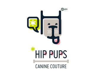
This fictitious company logo is the result of happenstance typographic exploration. I was playing around with H and I letterforms set in Platelet, and, after placing the I within the H, I noticed that it started to look like a dog face. After some modification, and with the addition of a curved P for an extended dog tongue, the resulting typographic illustration spelled "HIP." I thought it would be fun to name this fictitious company Hip Pups, which could be a shop that sells high-end dog accessories. The Registered symbol is integrated creatively into the mark by spelling "RUFF!"
Status:
Just for fun
Viewed:
4290
Share:


Lets Discuss
Thanks for the floats, you guys!
ReplyNice dog!
ReplyThanks, Kamil!
Replylove the look on this one! the style is very hip for sure :)
ReplyThanks, Reno!
ReplyLike the dog, the colors, the style.
ReplyAlways loved this one!
ReplyPlease login/signup to make a comment, registration is easy