Description:
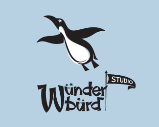
WIP for a future ATOMICvibe sub-brand. Can't yet disclose the full nature of this sub-brand, but it will be art-related. The icon used here is repurposed and modified from a letterpress poster I designed as a graduation gift for my fiancée when she finished her 1-year Master's program. Click here to see the poster on my Flickr stream. We have a thing for penguins. The flying penguin symbolizes aspirations and great achievement. Type is custom, and the Us are made to look like bird beaks pointing down. The umlauts over the Us form the bird's eyes, while the negative space within the bowls of the Us forms the beaks. The whole typeface is built around the shape of the U, and is meant to evoke a funky, retro style.
Status:
Work in progress
Viewed:
7084
Share:
Lets Discuss
so great !!!! --- like it !
ReplyThanks for the compliment, Bernd! I appreciate you checking this one out.
Replyits no
Replylove the whimsical vibe of the illo!
ReplyThanks, Reno! Yeah, I had a ton of fun with this one.
ReplyThanks to all the swimmers. Any comments? Suggestions? Love it? Hate it? Anything?
ReplyEdited to bring the type into a more condensed unit. Any thoughts?
ReplyThanks for the floats, guys! This is probably going to be a WIP for some time (since it's a mark for myself), so any suggestions or constructive crits are welcome. I'm actually working on some adjustments to it right now, one of which being to reduce the weight of the W, since it's looking really heavy right now. Another thing I'm debating is whether or not I need the nostrils in the beaks. At this size, in a full lockup, I'm not sure if it's overkill. Maybe it'd be OK if this were just an all-type execution. Another thing I'm considering is another version in which the penguin is holding the flag. I'll post up some stuff as I go along.
ReplyFun stuf man%7E!
ReplyThanks for looking, and for the float, Gert!
ReplyThanks, Romanovich! And thanks to all the swimmers!
ReplyO! Very very best! Talented work!
ReplyThank you for the nice comment, Zoya!
Replyhow could I missed this one....that's awesome!
Reply%5EIndeed! Lovin' the poster shots too, Jon!
ReplyWOW, thanks for the wonderful comments, guys! Haven't had a ton of activity on this one, so I figured either people just weren't feeling it, or it just slipped through the cracks.**How do you guys feel about the nostrils in the bird beaks/U letters in the type? Are they overkill?**What about the size relationship of icon to type?
ReplyIn this work all is good, Jon. Very good and beautifully!*I'm sorry for my English)
ReplyI don't see anything wrong buddy, it's in my fav box! already :)
ReplyThanks, Zoya and Hanuman! I appreciate the feedback :)
ReplyI look and rejoice!)
Reply20:)
ReplyThanks, guys!
ReplyNice work - Bravo!
ReplyStill wait for the upcoming! :)
ReplyPlease login/signup to make a comment, registration is easy