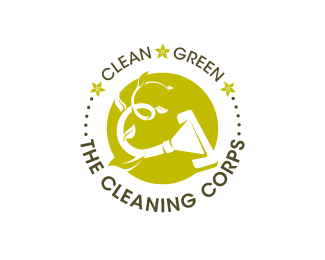
Description:
Washington, D.C. area cleaning and restoration service, specializing in carpet and upholstery cleaning, and ceramic tile and grout cleaning. TCC originally wanted to position itself as a pioneer in offering environmentally-friendly cleaning services, and to promote the philosophy of ethical practices and ideals. This option, an exploration of an official-looking seal, captures the green element with the coiling, double-C shaped vine that becomes a vacuum head.
Status:
Unused proposal
Viewed:
4788
Share:



Lets Discuss
This one depicts the green aspect more IMO
ReplyYeah, I, too thought it was the more %22green%22 of the batch. But after some discussions with the client, they decided that emphasizing the green aspect in their logo might cause the mark to look too faddish, since everyone's on the green bandwagon these days. We all thought that in a number of years, once green is the norm, all these logos that are overdoing it with the green themes are going to seem dated. They ultimately decided to portray strength and dependability, and thus, they chose this as their final mark: http://logopond.com/gallery/detail/120654
Replylove this version ... funny mixture of natural born cleaning competence ...
ReplyThanks for the compliment, Bernd!
ReplyPlease login/signup to make a comment, registration is easy