Description:
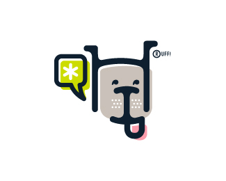
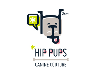
This fictitious company logo is the result of happenstance typographic exploration. I was playing around with H and I letterforms set in Platelet, and, after placing the I within the H, I noticed that it started to look like a dog face. After some modification, and with the addition of a curved P for an extended dog tongue, the resulting typographic illustration spelled "HIP." I thought it would be fun to name this fictitious company Hip Pups, which could be a shop that sells high-end dog accessories. The Registered symbol is integrated creatively into the mark by spelling "RUFF!"
Status:
Just for fun
Viewed:
5237
Share:

Lets Discuss
Very nice this dog.
ReplyCheers, Moises! Thanks for the nice comment, and thank you for the floats, guys!
ReplyUpdated to include more dog-like ears, and a curved crossbar on the H that mimics the curves on the I and P.
Replywhat is it? please explain to non-British:)
ReplyOK Sergey, I'll try. The mark is just for fun. It's a logomark for a company called Hip Pups (this is American slang for %22Cool Dogs%22). The dog head is made out of the letters H, I, and P, which spell %22HIP.%22 The company could be a store that sells trendy dog accessories. See the full logo here: http://logopond.com/gallery/detail/142187
ReplyToo many words in one sign
Reply%25)*http://www.youtube.com/watch?v%3DlrSKG3TS0uE%26feature%3Drelated
ReplyThank you for the floats, everyone!
Replynice
Replynice
ReplyPlease login/signup to make a comment, registration is easy