Description:
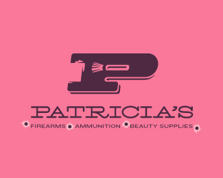
This logo is another self-initiated experiment for a completely fictitious company called Patricia's Firearms • Ammunition • Beauty Supplies. This all started when I noticed that the negative space with the letter P set in Blackoak looked a bit like a gun firing a bullet. This got me thinking of how interesting it would be if there were a super-girly, female-owned and operated boutique, catering only to women, which sells not only firearms and ammunition, but also beauty supplies. Everything a modern woman needs! Hey, if you're gonna make up a logo and a company to go with it, why not have a little fun? Here, the left side of the P reveals the profile of a gun barrel in negative space, while the negative space within the bowl of the P reveals a makeup brush, which doubles as a bullet being fired. The P mark, based on the Blackoak letterform, is constructed by hand, and the type for "Patricia's" is based on Archive Antique Extended, and is also constructed by hand. I did this because I wanted rounded corners and edges to give the logo a more feminine touch. To see the development of this logo, check out my Patricia's Flickr stream.
Status:
Just for fun
Viewed:
5551
Share:






Lets Discuss
The objects in the negative space are a little difficult to make out. I actually think the bullet/lipstick works better. Awesome project though!
ReplyHmm, see, I felt that the lipstick didn't quite read as a lipstick. I dunno...
ReplyThen again, I'm not super-familiar with beauty products...
Reply%5EHA! Right? Also, the lipstick silhouette starting looking like a... umm... a... female %22massager,%22 if you know what I mean. That shape is a bit hard to define properly as a silhouette — especially in a small size.
Replyno idea what you are talking about guys ... %22lipstick massage toys%22 ? ! ? but seriously ... the problem could be a too small negative space ... no one would be able to identify this little bullet piece ... but great try ... %3BP
ReplyI appreciate the feedback guys, but I really need some female input, too, since this is supposed to appeal to women. Ladies, wuddaya think? Does that look like a makeup brush? Also, what about the highlight on the makeup brush handle (also the bullet), which is ALSO the shadow of the P showing through the negative space? Do you think that helps or hinders the design?
ReplyPlease login/signup to make a comment, registration is easy