Hip Pups v.2 - full lockup
by atomicvibe • Uploaded: Jul. 19 '11 - Gallerized: Jul. '11

Float
(Floaters:
46 )
Description:
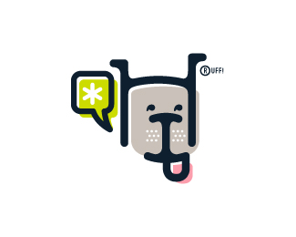
Made some changes to the face to make it a bit more dog-like. This fictitious company logo is the result of happenstance typographic exploration. I was playing around with H and I letterforms set in Platelet, and, after placing the I within the H, I noticed that it started to look like a dog face. After some modification, and with the addition of a curved P for an extended dog tongue, the resulting typographic illustration spelled "HIP." I thought it would be fun to name this fictitious company Hip Pups, which could be a shop that sells high-end dog accessories. The Registered symbol is integrated creatively into the mark by spelling "RUFF!"
Status:
Just for fun
Viewed:
10988
Tags:
bone
•
asterisk
•
animal
•
character
Share:

Lets Discuss
I appreciate the floats, guys!
ReplyUpdated to include more dog-like ears and a rounded crossbar to the H to match the curves of the I and the P.
ReplyAny comments? Suggestions?
Replyhey Jon congrats on the gallery spot! love that little ruff there haha, nice!
ReplyWHOA! I just saw that this made the gallery! And here I was thinking that this one was gettin' no love since no one was commenting on it. Thanks everyone! I really appreciate all the support. I feel like my time spent browsing this site, and seeing amazing work by the top logo designers in the world has been majorly influential, and has really helped me to be a better designer. Major props to the LP community for providing such a tremendous inspirational resource.
Reply@Reno, thanks for the nice words, my man! And yeah, I don't know if it's legal or not to embellish a Registered symbol (I'm sure a quick Google search would clarify this), but I figured, why not? This is just for fun, so why not use it as a design element? Most times, those damned things just end up detracting from otherwise beautiful marks.
Replylike the style of this work. really good job that u hade made trying to put those letters in dog head. fantastic
ReplyThanks for the nice words, qyper!
Replymissed this one. lovely, mate!
ReplyThanks, Hertz! I appreciate you checking this one out :)
Replywow! very original style!
ReplyThanks for the compliment, Antonio!
ReplyThe subtle adjustments to this version are a nice improvement.
ReplyThanks for checking this one out, Jeff! I appreciate your feedback. Cheers.
Replyreally cute! maybe you should try to size down the mark
ReplyNice style
ReplyThanks for the feedback and floats, guys!
ReplyPlease login/signup to make a comment, registration is easy