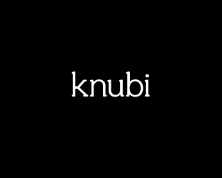
Description:
For the past year I have been working on and off creating my debut font Knubi. Well! it's finally finished and downloadable on my website.
I invite you to check out the presentation and feel free to take it for a test spin.
380 glyphs supporting 80 languages.
I'm knackered!
As seen on:
FREE FONT DOWNLOAD
Status:
Just for fun
Viewed:
6254
Tags:
matt vergotis
•
verg
•
typeface
•
knubi
Share:

Lets Discuss
Good on ya mate! Looks awesome. Enjoyable presentation too :)
Reply. great .
ReplyAmazing font.
ReplyThank you all for the comments. I hope you enjoy using Knubi - If you have any feedback I'll take it on board for version 1.1. Cheers!
ReplyThat's fantastic! I will have to check it out. Good job!
ReplyThat looks great.. nice font..
ReplyGreat work again, Matt.
Replyalso a great name being a newbie to the business. :)
ReplyI mean font creation that is.
ReplyThanks guys for the comments.
Reply@mike. Cheers mate. Stoked you like. Yeah, whilst originally it was meant to be pronounced NUBBY (the serifs being nubb-like), I have been pronouncing it NEWBIE for the same reason you mentioned. Either way I quite like although newbie seems to be sticking.
@uscila Thanks for the massive compliment. I will definitely be doing another font. Lots of work, but it's rewarding when it's all finished.
Nicely done, Matt. Got it, love it! :)
ReplyReally excited to use it. I know what goes into a font, takes a lot of (dedication). I can tell that you started from scratch and not used an existing font if I'm correct, and that's impressive. I think this font has great potential, looking forward to a bolder version too.
ReplySweet work Matt...thx
Reply@ Mike Bruner: Cheers mate! Stoked you like. I'm pumped on fast-tracking the bold and italic versions now that people are showing interest. Thanks for the support.
Reply@Mick Erickson: Thanks again, Mike. Yep! All from scratch. At the start I actually tried to set myself a challenge to see how I could get on without even referencing another font. So for the best part of it, it was all off the top of the dome. When I got serious about making it a real working font, I went back through it and cross-checked consistencies that a couple of popular fonts had, studying a lot of the characteristics certain letters shared and then refined my version.
@Nitish: Cheers buddy.
Please login/signup to make a comment, registration is easy